|
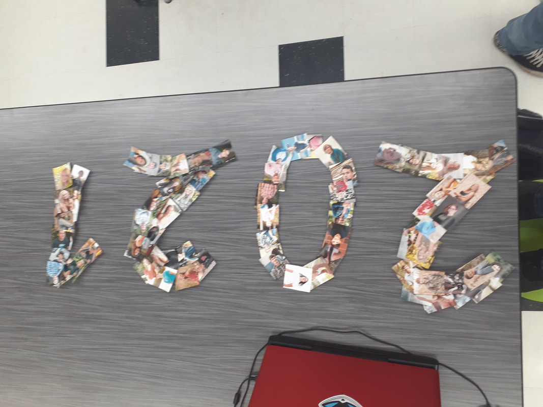
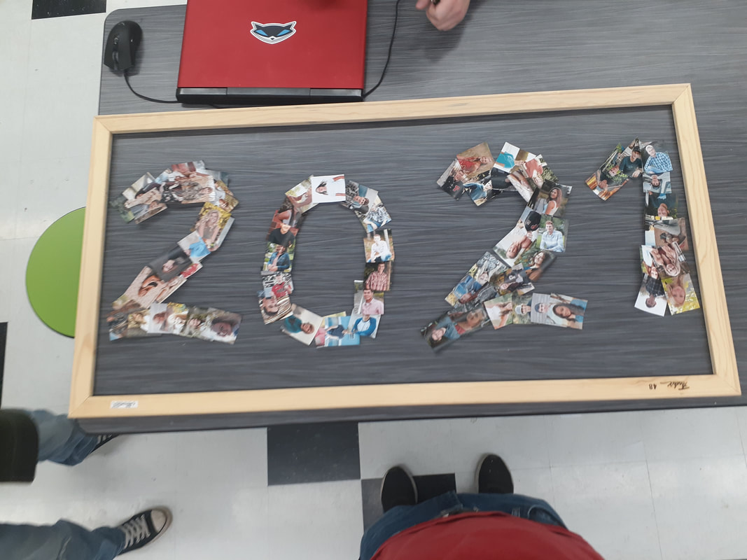
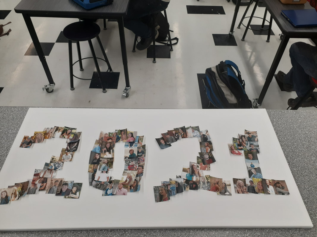
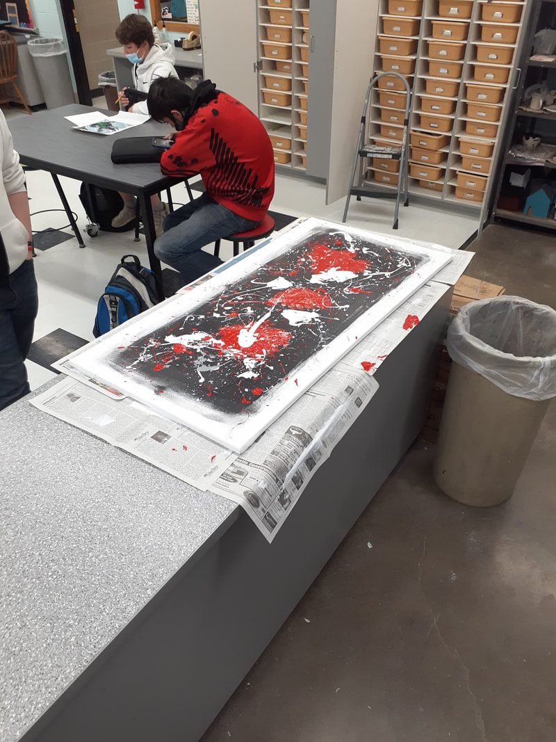
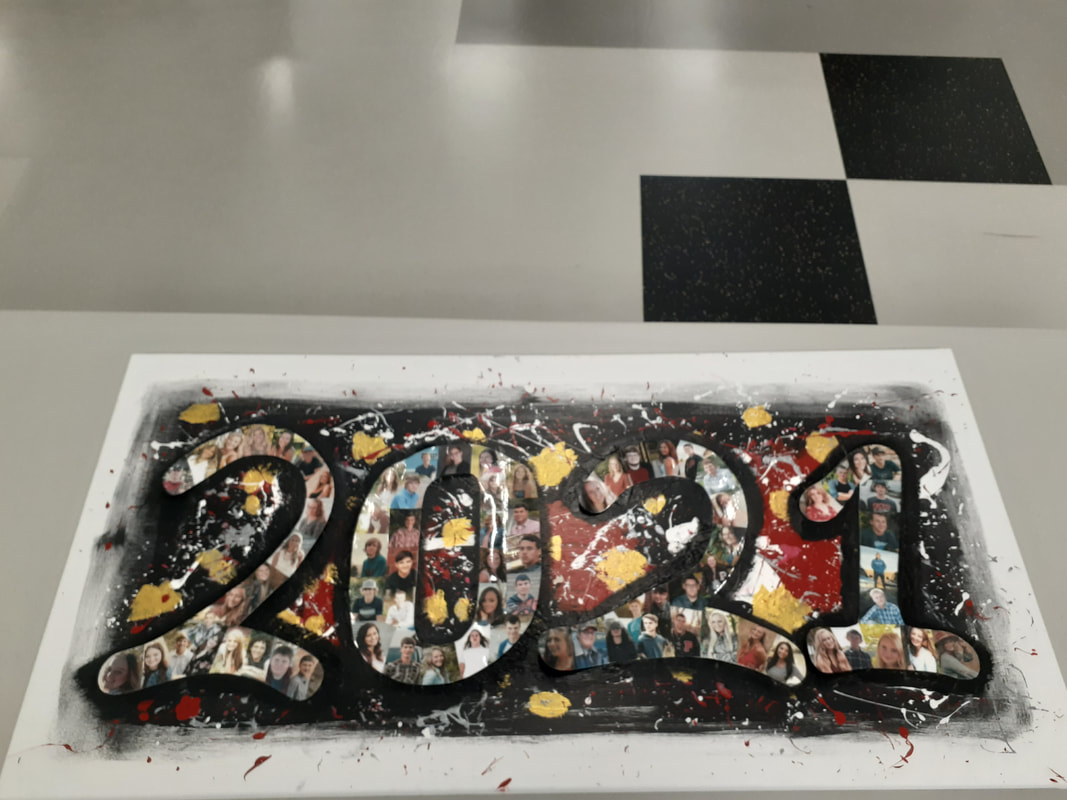
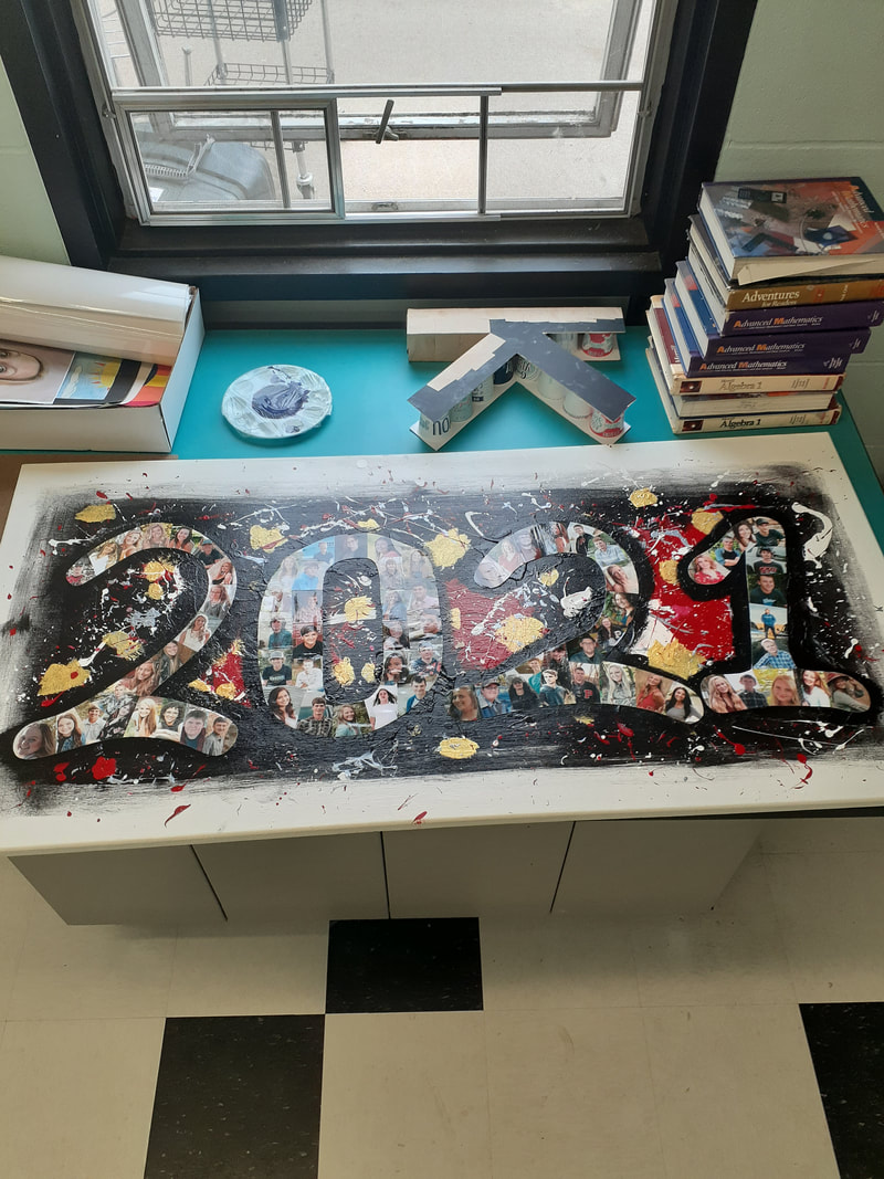
This artwork is a large collage of all 2021 senior photos over a splatter paint background. On the white canvas is a large rectangle of black, covered by red, silver, and white splatters. Above that is gold splotches and a large 2021 painted in black. Above the black numbers is a collage of senior photos in the shape of the number 2021. One the back of the canvas is the signature of every 2021 graduate. I started this artwork by stretching my own canvas. I wanted to make an artwork that used the largest frame pieces, so this piece was perfect. I started by painting a large black rectangle for the background. Once dried, I filled a gloved hand with red, white and silver paint (at separate times) and threw it at the canvas. Once the large paint globs were dried, I ran a finger through the colors and flicked it at the canvas o make the smaller splatters. I used a brush to paint on gold splotches, then painted a black 2021 over the whole thing. I then added my collaged 2021 on top of the black paint and glued the numbers down. After they were dry, I coated the whole work in a layer of clear spray paint. The numbers were created by taping down this year's senior photos to cut a poster board cut out 2021. I then cut around the images to make the numbers smooth around the edges. Finally, I cut the images between each other to make them fit together almost like puzzle pieces, then I laminated them. I wanted to create this piece to honor our senior class. The students pictured in this artwork have made me who I am. Some are lifelong friends, some I have quarrels with, some are yet to become friends. After the year we had, all of us share a sort of bond that is hard to come by. I wanted to represent that. I wanted to show that our senior class, while we go our separate ways, will always be a part of each other. A week after its creation, I decided to have all the seniors sign the back of the painting to further solidify our connection to one another. Overall, This is my favorite artwork of the year. Ive taken three art classes this year and this is the best piece I have made by far. Not only is it appealing to the eye, but it holds a special meaning to my class as a whole. The piece was made entirely from scratch, right down to the canvas. I put enough effort into this painting to feel accomplished with the semester. And the cherry on top is that I got to display it for the whole school to see, AND I get to hang it up at graduation. After this, I hope it gets to hang in the school's back hallway by the previous class paintings. That way people potentially can see my art for years to come.
0 Comments
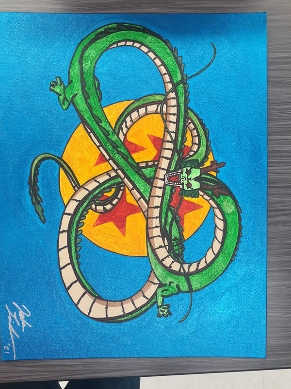
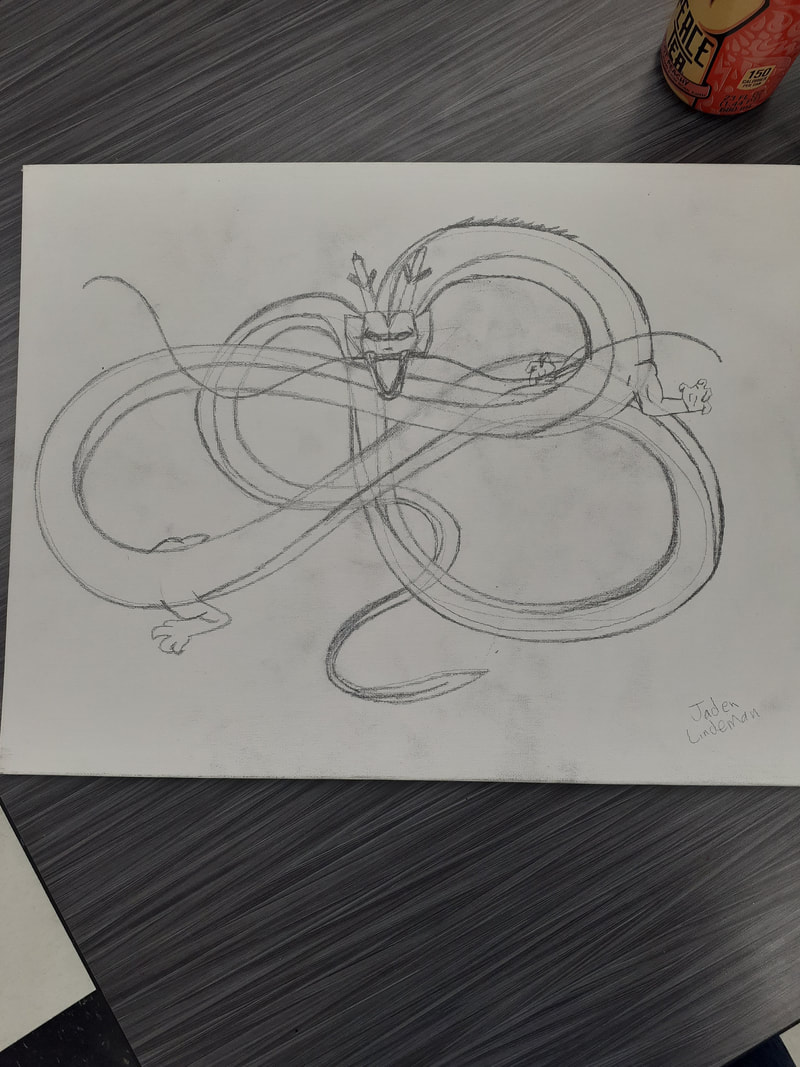
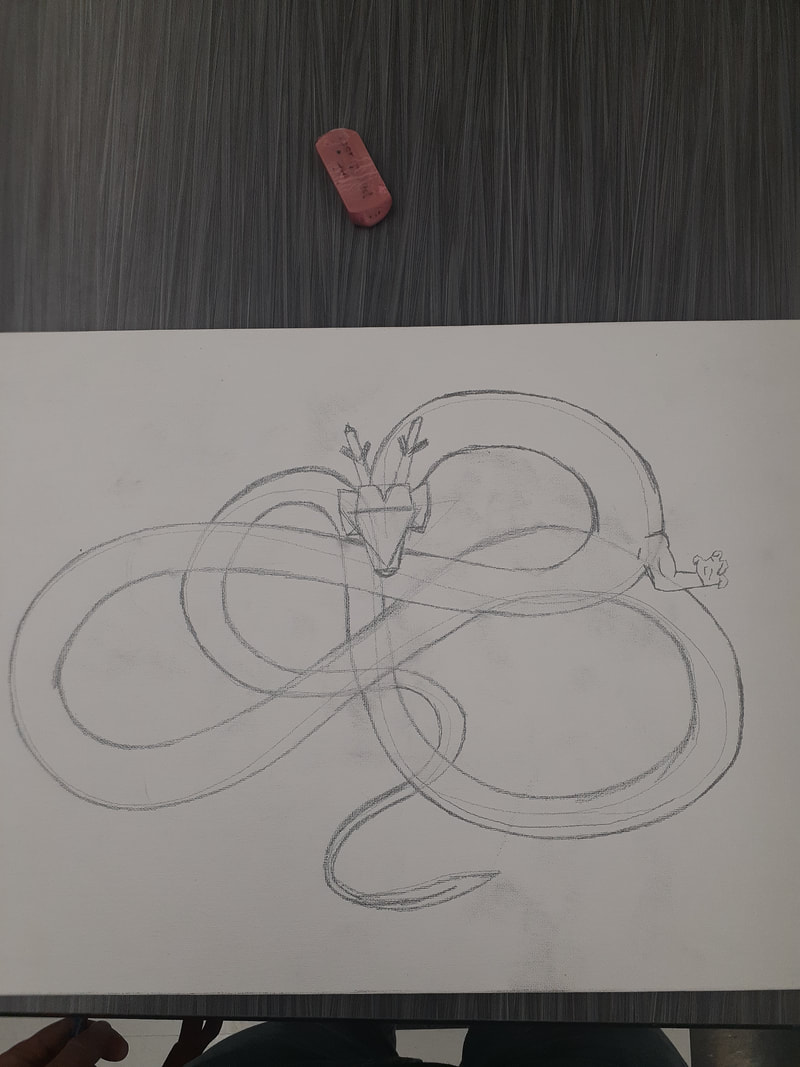
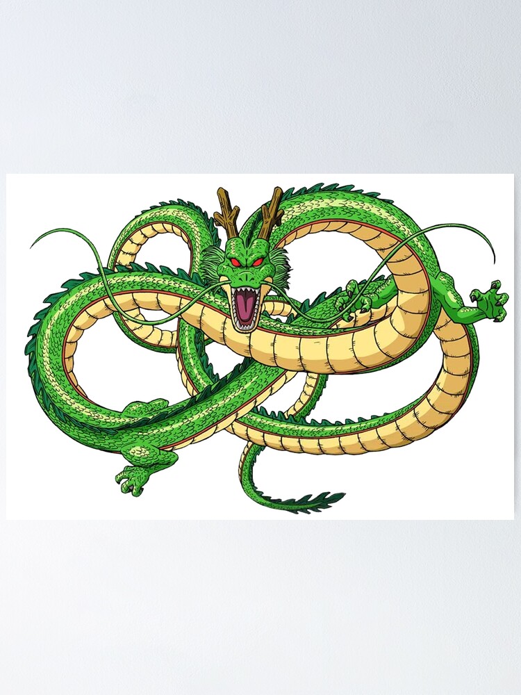
The artwork I consider the best of the semester would have to be the 2021, class painting. I had a mix of collage and painting, which I don't do often. The collage was difficult to make but turned out better than expected. The splatter painting was really fun to do. I also got to make another canvas, which is always fun. If I could redo an artwork, it would have to be the painting of Shenron the dragon. While it did turn out great, I think it could've been better had I used acrylic paint throughout. I also think it could've been more accurate to the original had I taken more time on it. The main takeaway from this semester that I have is to try new things. I used to only make drawings, but this semester I couldn't stop painting. It was so fun to do something different that also turned out great. I also used many new and weird painting techniques this semester that greatly added to my artistic library. With my cotton candy skies painting, I used so many different techniques I couldn't pick one to say I did the majority of the painting with. That was also the piece that I used a different strategy, painting without waiting. I took a lot of risks and they all paid off. If I had to pick one project, it would have to be portraits. Whether they be self portraits or of someone else, a whole unit on focusing on someone's features would've been great. I likely would've went back to drawing for the unit, but it would've been a nice change of pace. I was cranking out artworks so fast this semester that I never really took time to make something incredible. If we would've had a portrait unit, I would've slowed down a bit. This artwork is an acrylic painting of Shenron, the dragon from the anime Dragon Ball. The dragon is made entirely of acrylic paint and sharpie. I used a black sharpie to outline everything and a bronze sharpie to highlight the shadows on the stomach. Behind the dragon is the fourth dragon ball, with a solid blue background. The green areas have a bit of colored pencil on them to add some texture. I started with a sketch of the dragon in the general shape of what I wanted. Then I added details layer by layer. After the drawing was done, I put down a layer of paint. After the paint was dried, I used a green colored pencil and bronze sharpie to accentuate shadows and details, all followed by a black sharpie to outline every detail. I purposefully outlined every detail in order to make it look more comic book-esque. There really wasn't any inspiration for this artwork. Daryn just asked if I could make a painting for him. I knew he liked Dragon Ball, so I thought I would paint him a character from the show. After painting Shenron, the canvas still looked a bit blank, so I added a dragon ball behind Shenron. Then I just painted the background metallic blue to add some contrast to the entire piece. I mostly painted this piece just for it to be a nice gift for Daryn. Overall, I think this artwork was pretty successful. It's not super significant to me because there wasn't any inspiration, but I still am happy with it. Daryn was so happy with the final project that It made me proud of it. I like how it turned out. It is accurate to the original depiction and it just looks cool. |
AuthorWrite something about yourself. No need to be fancy, just an overview. Archives
May 2021
Categories |

 RSS Feed
