|
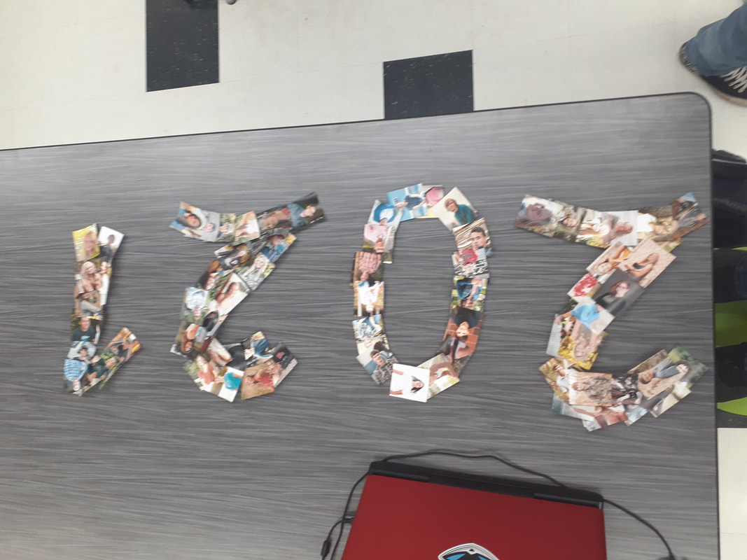
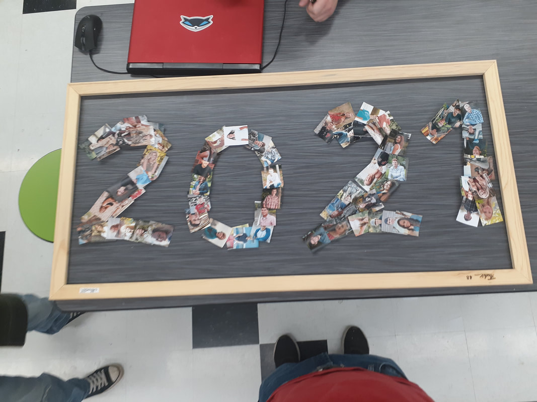
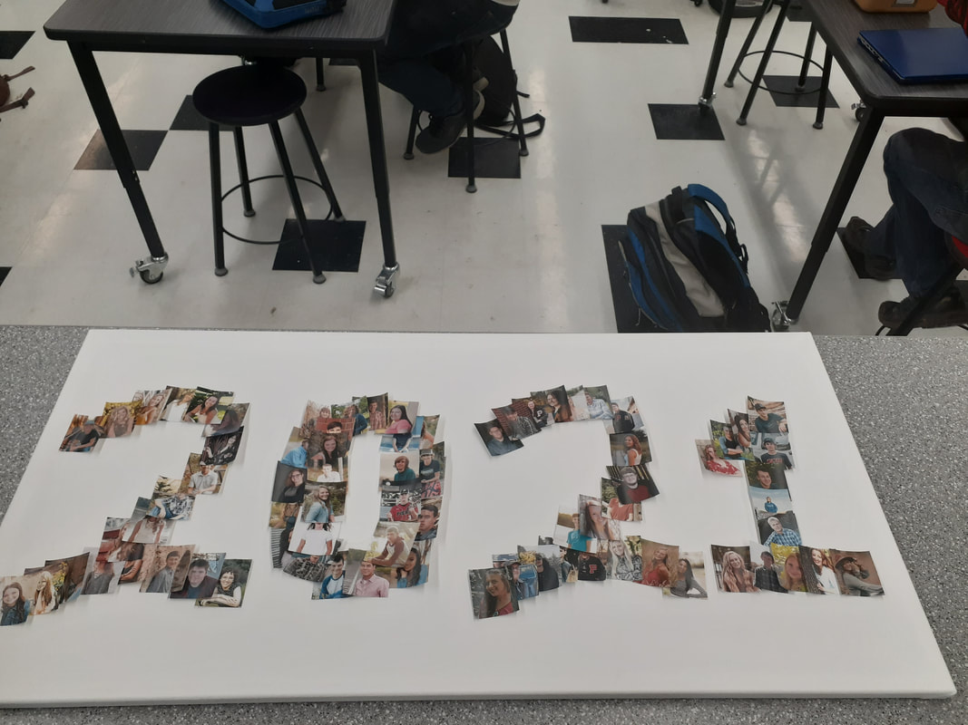
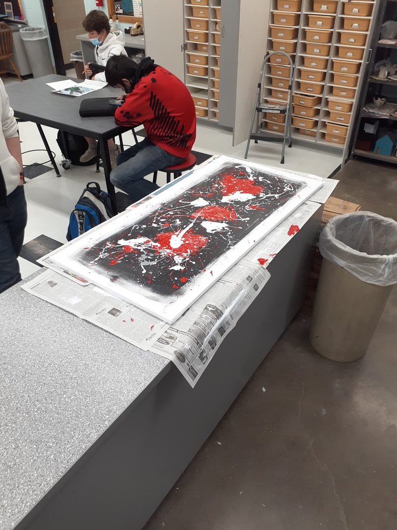
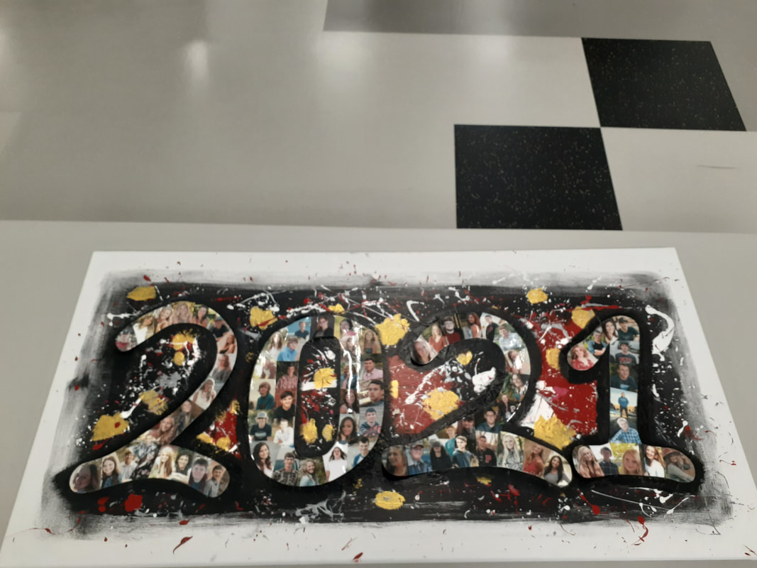
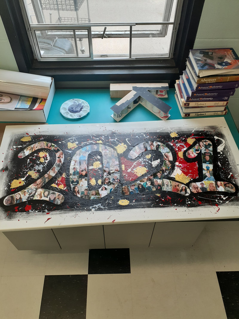
This artwork is a large collage of all 2021 senior photos over a splatter paint background. On the white canvas is a large rectangle of black, covered by red, silver, and white splatters. Above that is gold splotches and a large 2021 painted in black. Above the black numbers is a collage of senior photos in the shape of the number 2021. One the back of the canvas is the signature of every 2021 graduate. I started this artwork by stretching my own canvas. I wanted to make an artwork that used the largest frame pieces, so this piece was perfect. I started by painting a large black rectangle for the background. Once dried, I filled a gloved hand with red, white and silver paint (at separate times) and threw it at the canvas. Once the large paint globs were dried, I ran a finger through the colors and flicked it at the canvas o make the smaller splatters. I used a brush to paint on gold splotches, then painted a black 2021 over the whole thing. I then added my collaged 2021 on top of the black paint and glued the numbers down. After they were dry, I coated the whole work in a layer of clear spray paint. The numbers were created by taping down this year's senior photos to cut a poster board cut out 2021. I then cut around the images to make the numbers smooth around the edges. Finally, I cut the images between each other to make them fit together almost like puzzle pieces, then I laminated them. I wanted to create this piece to honor our senior class. The students pictured in this artwork have made me who I am. Some are lifelong friends, some I have quarrels with, some are yet to become friends. After the year we had, all of us share a sort of bond that is hard to come by. I wanted to represent that. I wanted to show that our senior class, while we go our separate ways, will always be a part of each other. A week after its creation, I decided to have all the seniors sign the back of the painting to further solidify our connection to one another. Overall, This is my favorite artwork of the year. Ive taken three art classes this year and this is the best piece I have made by far. Not only is it appealing to the eye, but it holds a special meaning to my class as a whole. The piece was made entirely from scratch, right down to the canvas. I put enough effort into this painting to feel accomplished with the semester. And the cherry on top is that I got to display it for the whole school to see, AND I get to hang it up at graduation. After this, I hope it gets to hang in the school's back hallway by the previous class paintings. That way people potentially can see my art for years to come.
0 Comments
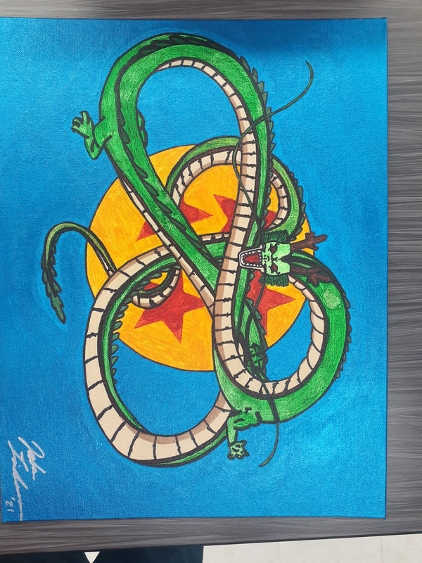
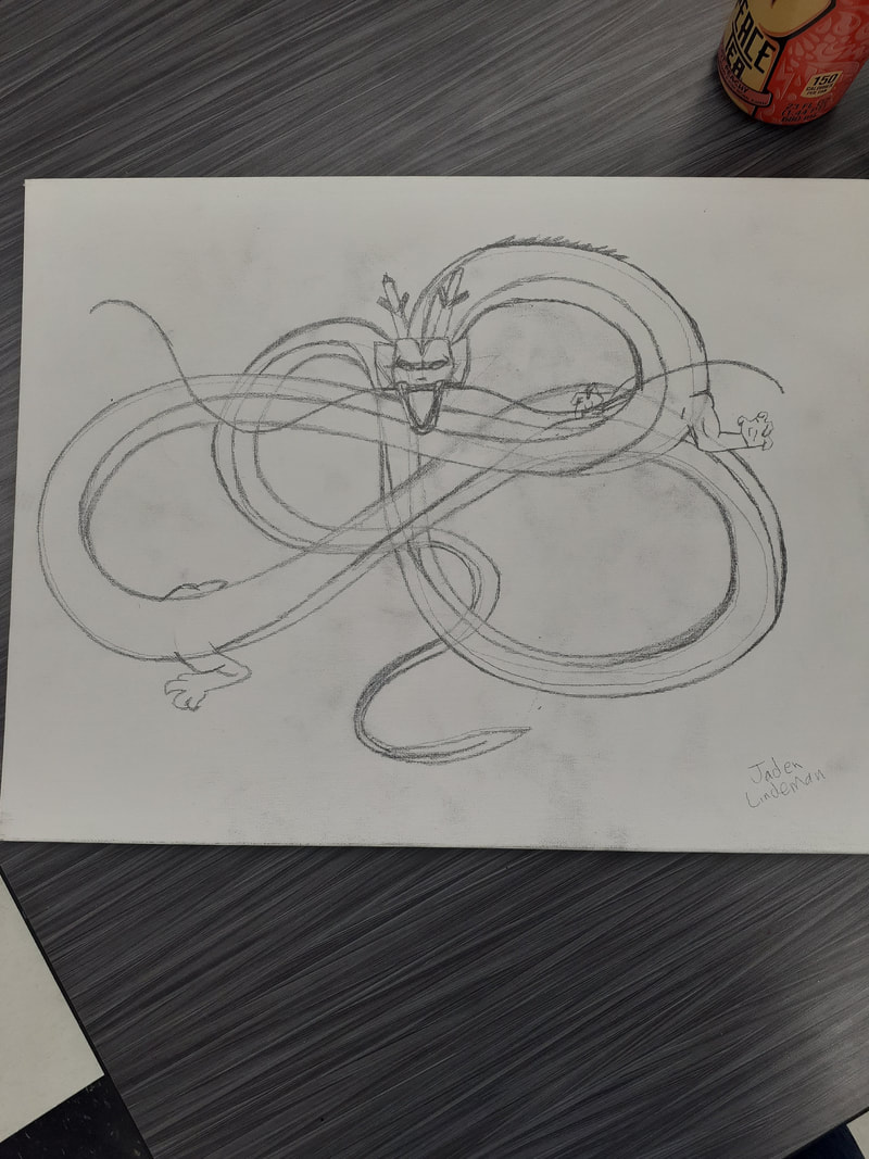
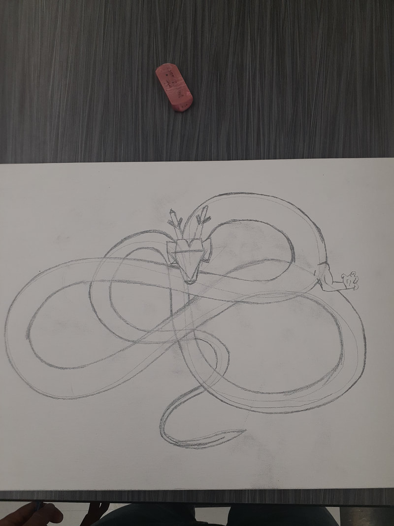
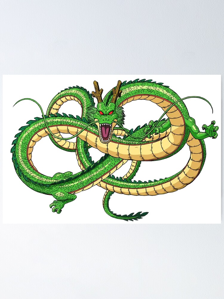
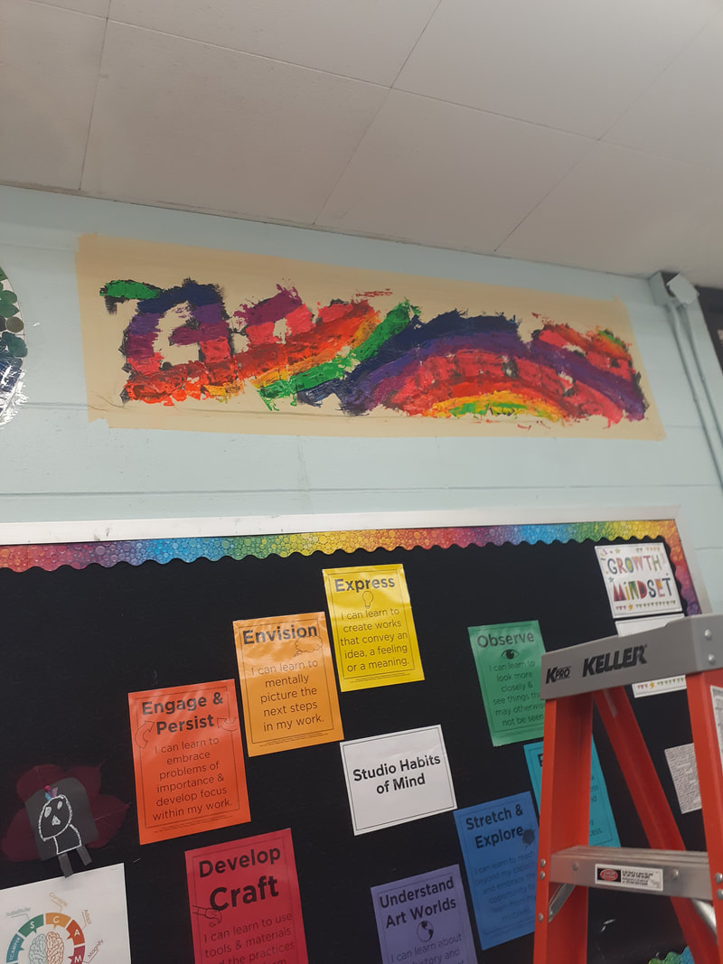
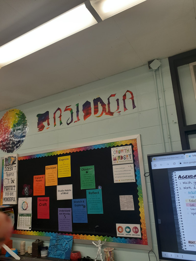
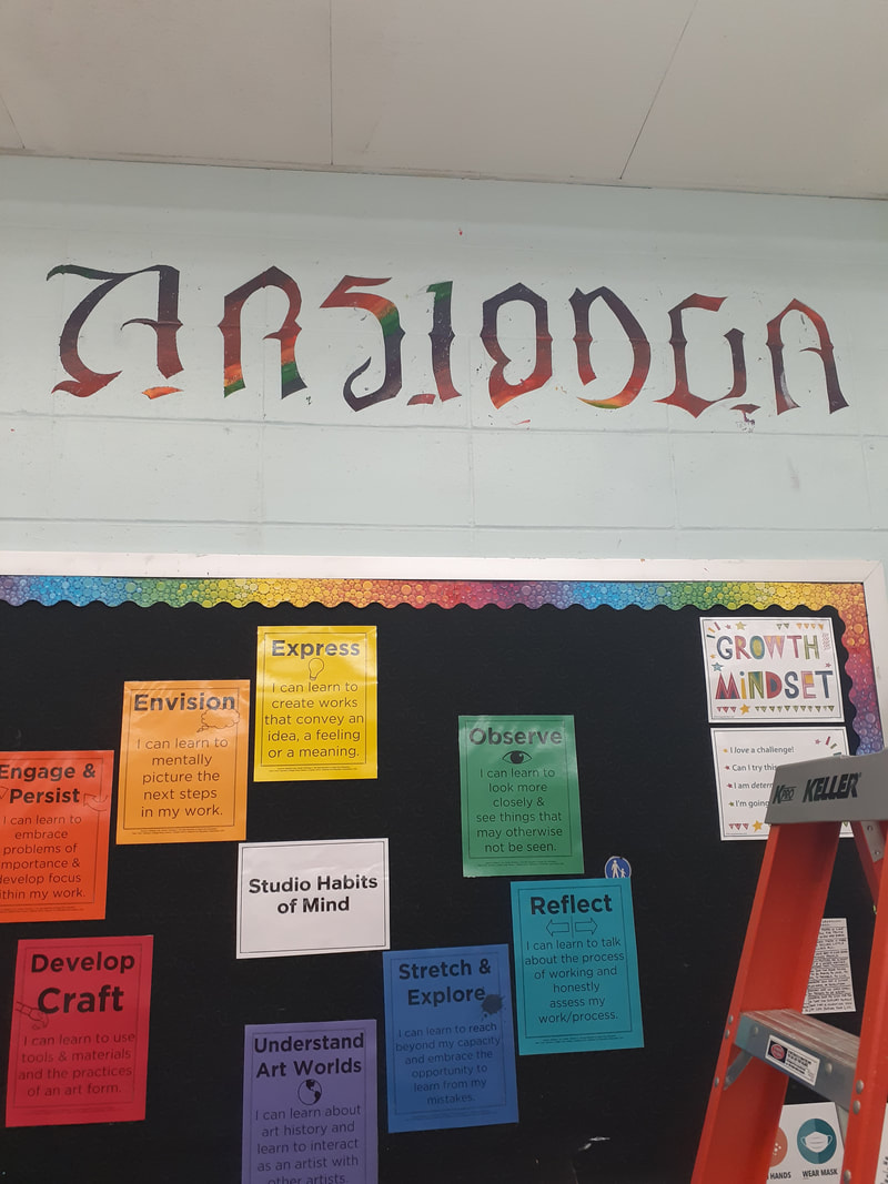
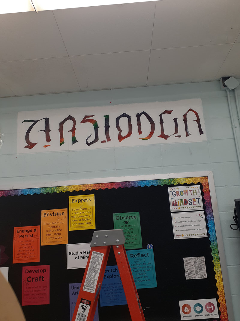
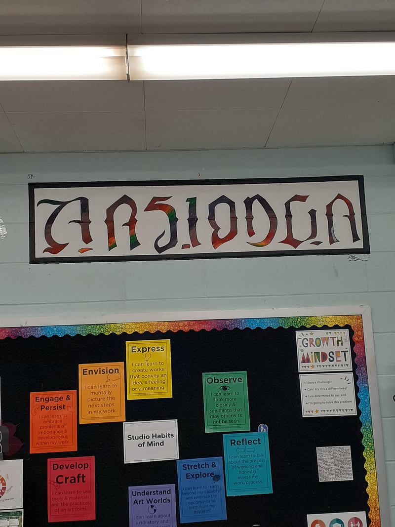
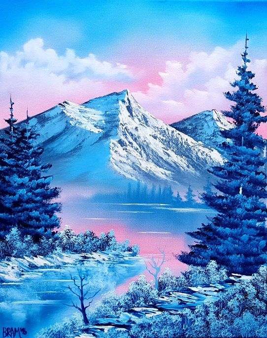
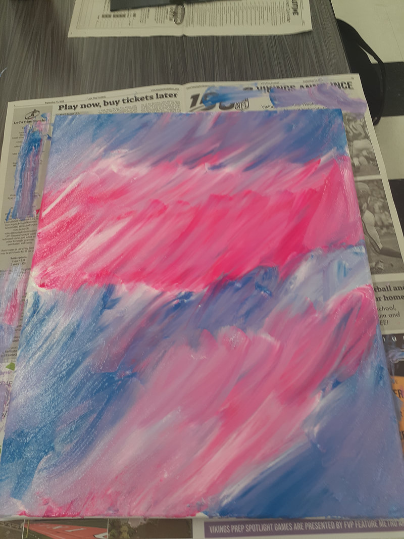
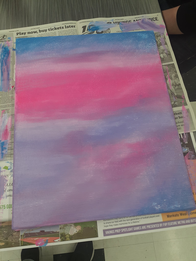
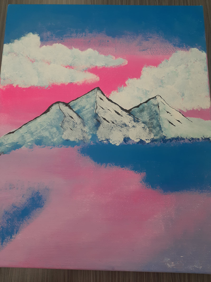
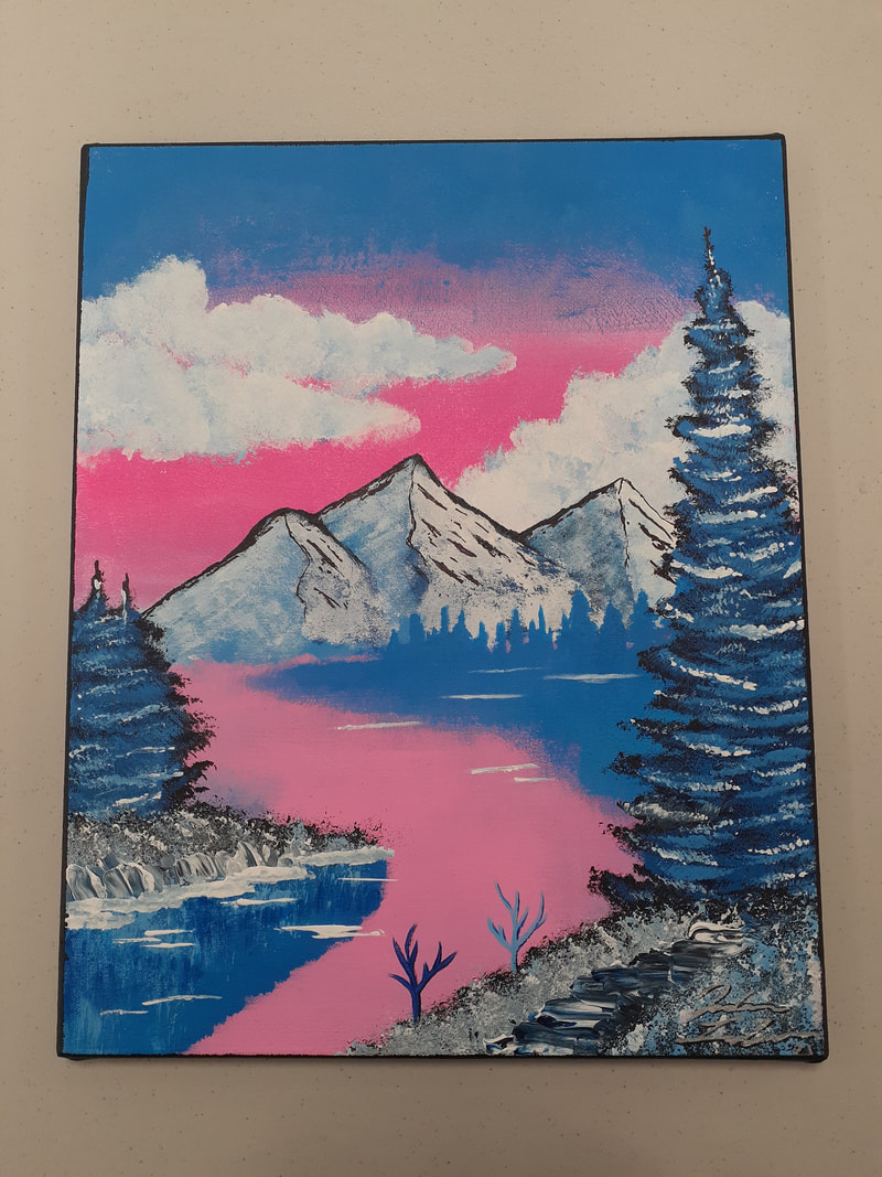
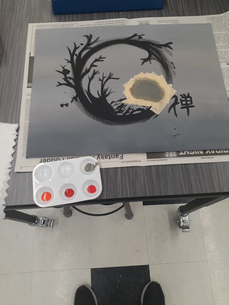
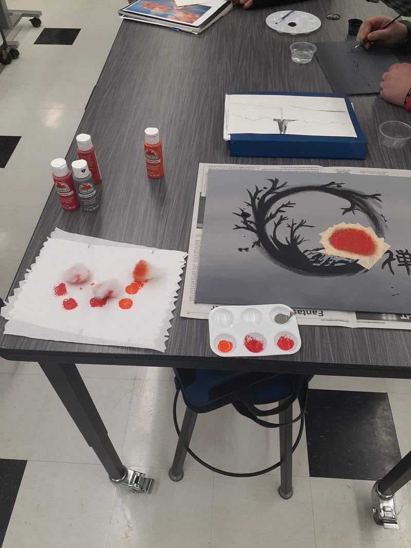
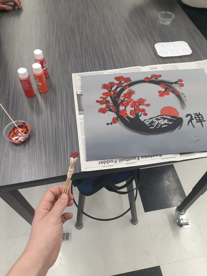
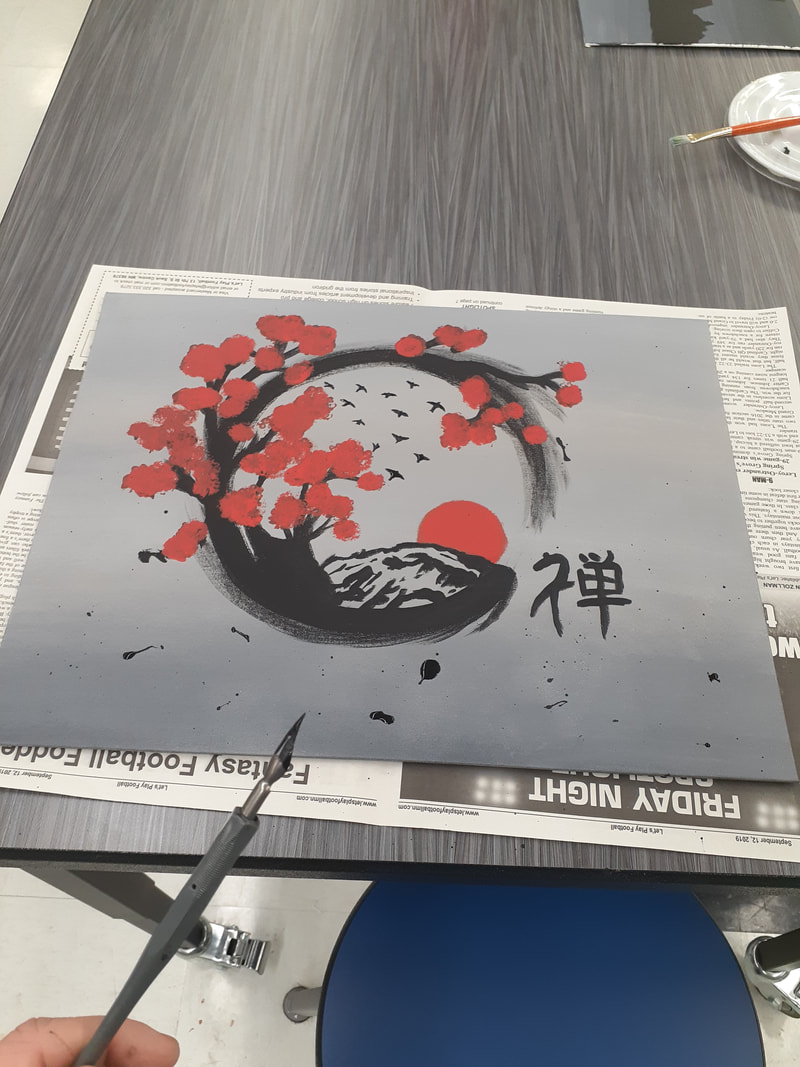
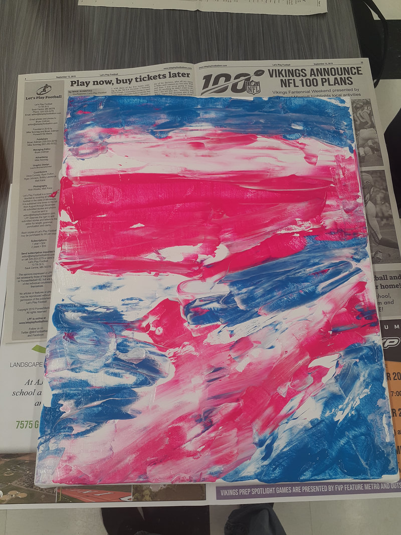
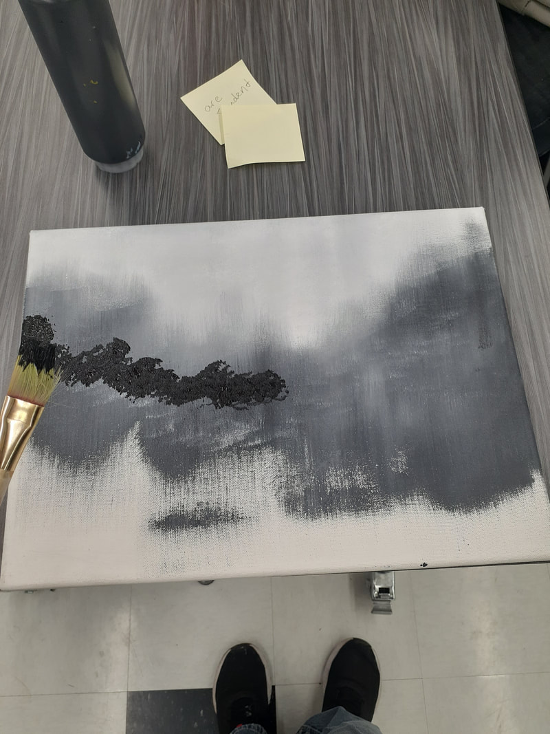
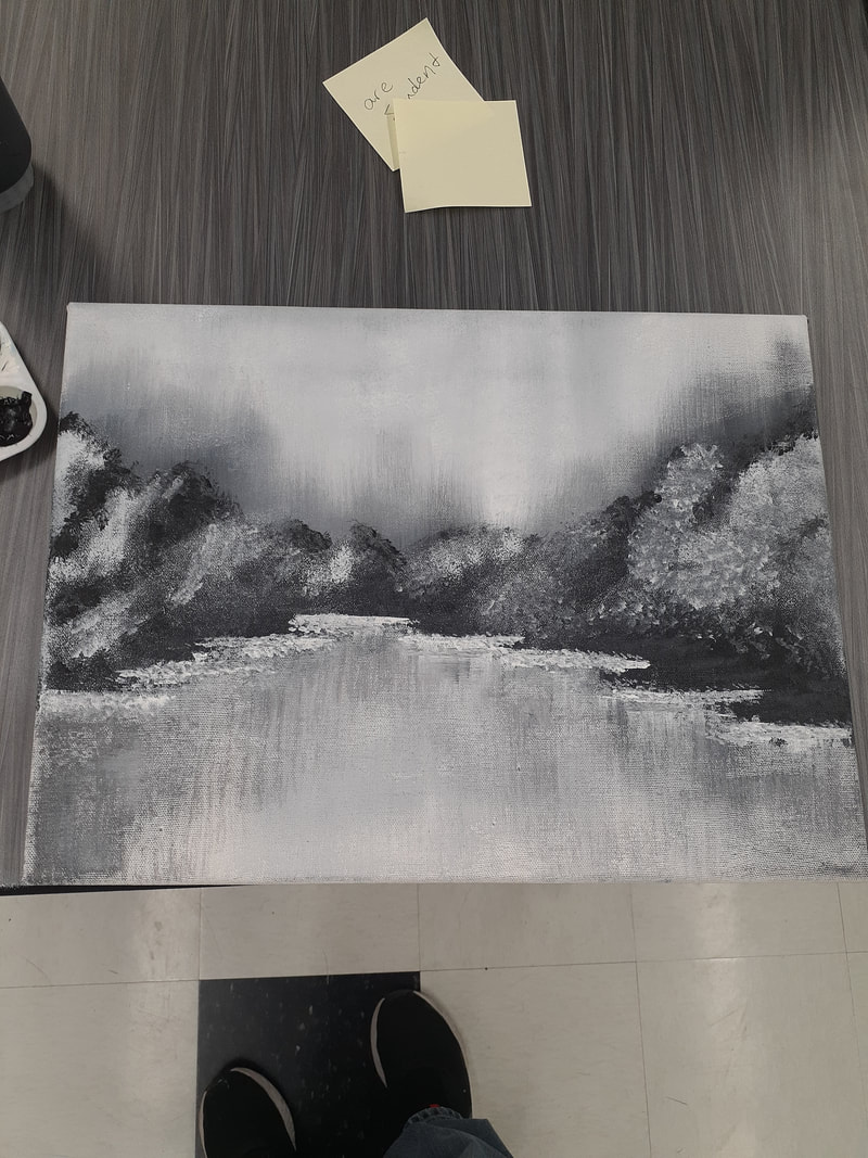
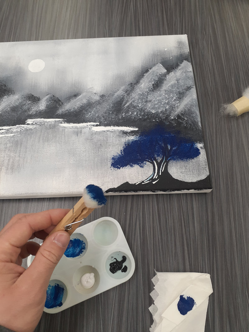
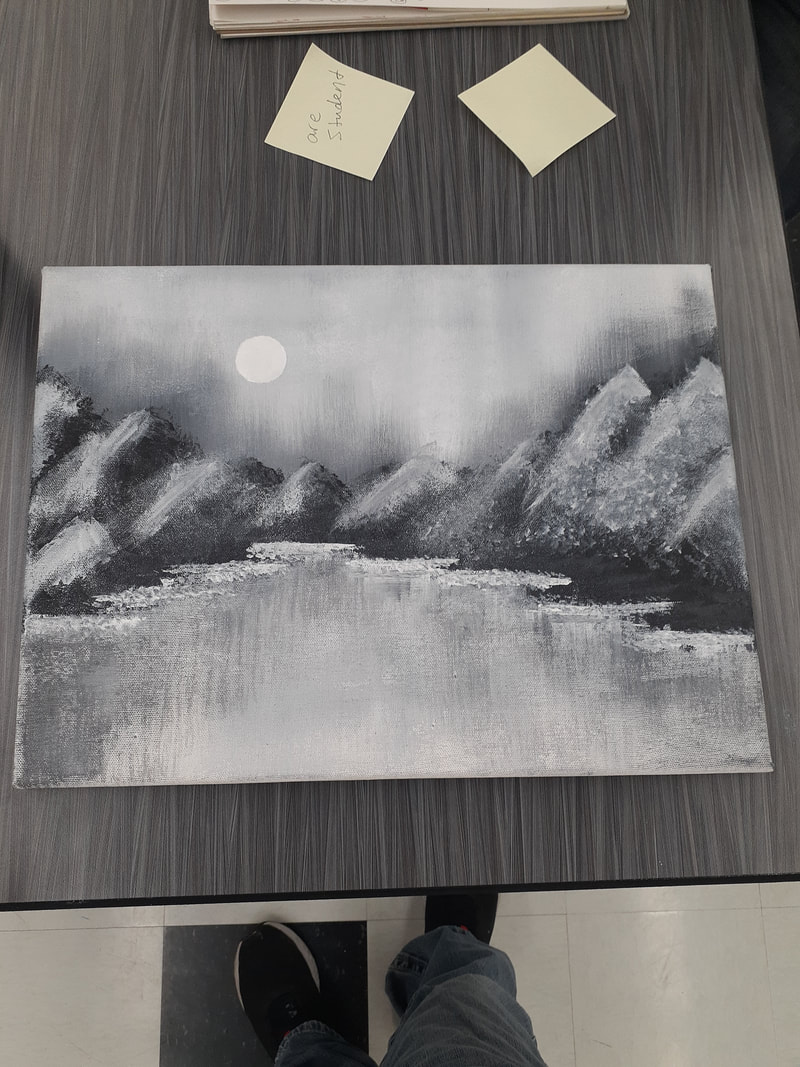
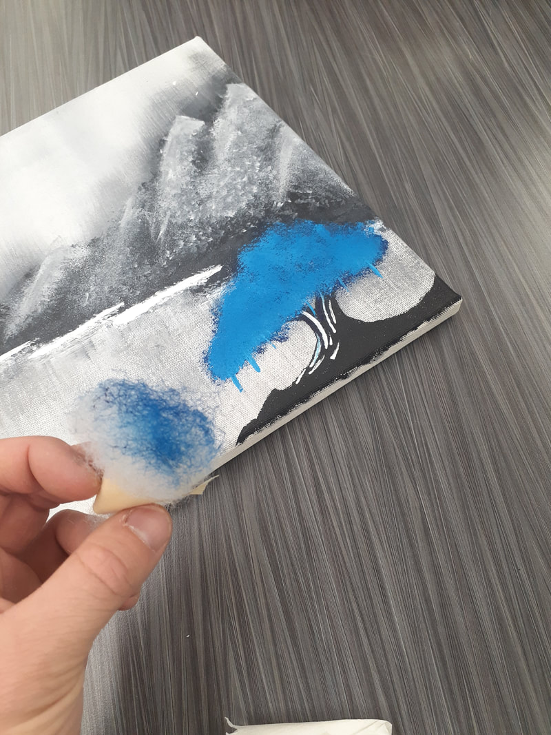
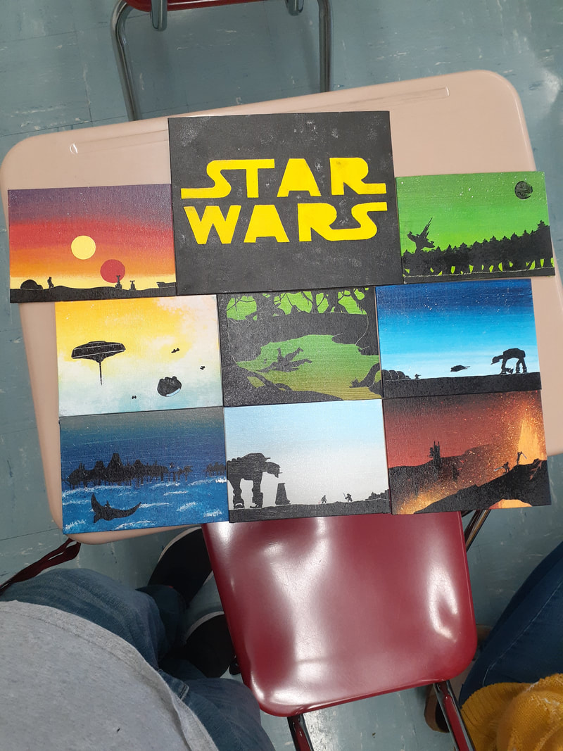
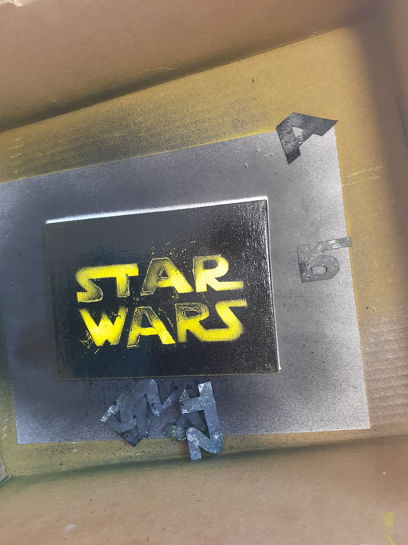
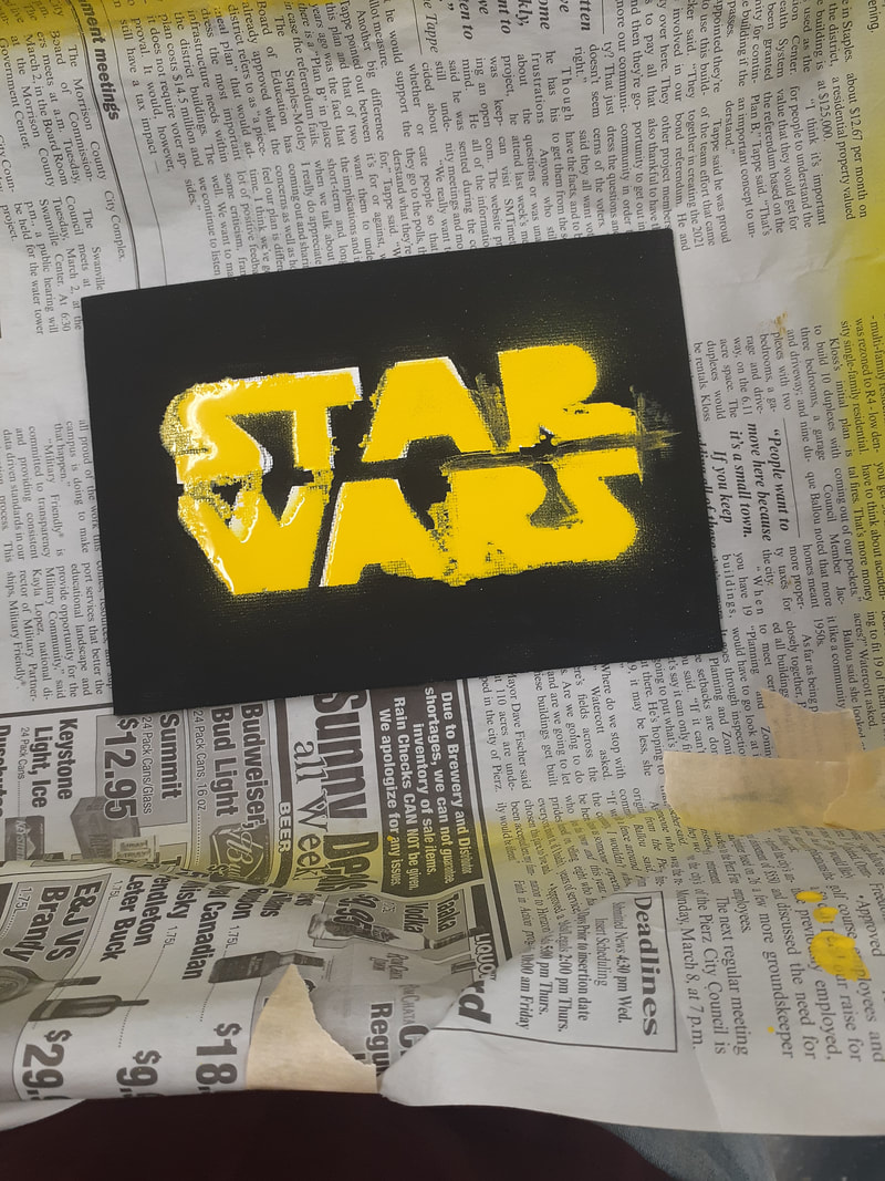
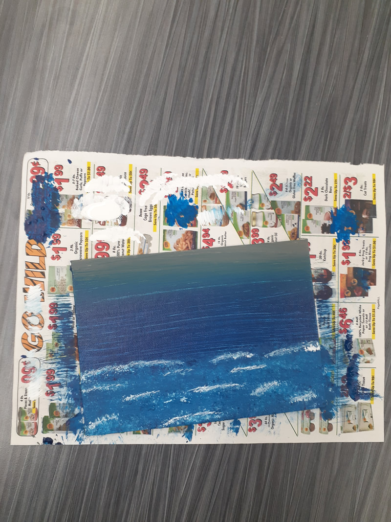
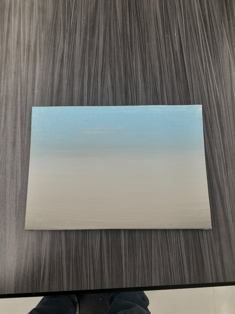
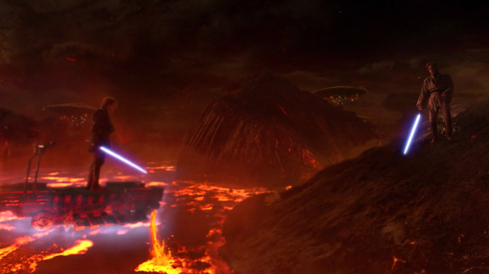
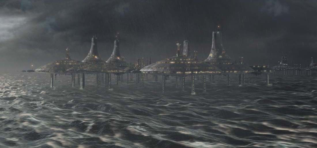
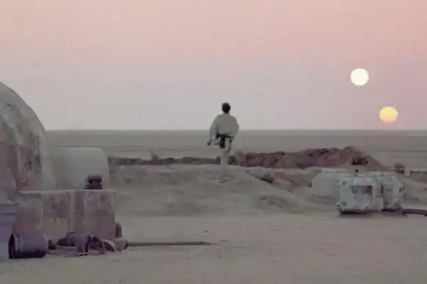
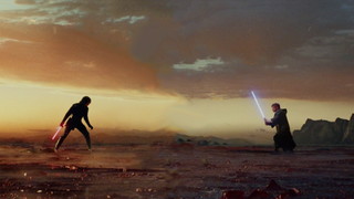
The artwork I consider the best of the semester would have to be the 2021, class painting. I had a mix of collage and painting, which I don't do often. The collage was difficult to make but turned out better than expected. The splatter painting was really fun to do. I also got to make another canvas, which is always fun. If I could redo an artwork, it would have to be the painting of Shenron the dragon. While it did turn out great, I think it could've been better had I used acrylic paint throughout. I also think it could've been more accurate to the original had I taken more time on it. The main takeaway from this semester that I have is to try new things. I used to only make drawings, but this semester I couldn't stop painting. It was so fun to do something different that also turned out great. I also used many new and weird painting techniques this semester that greatly added to my artistic library. With my cotton candy skies painting, I used so many different techniques I couldn't pick one to say I did the majority of the painting with. That was also the piece that I used a different strategy, painting without waiting. I took a lot of risks and they all paid off. If I had to pick one project, it would have to be portraits. Whether they be self portraits or of someone else, a whole unit on focusing on someone's features would've been great. I likely would've went back to drawing for the unit, but it would've been a nice change of pace. I was cranking out artworks so fast this semester that I never really took time to make something incredible. If we would've had a portrait unit, I would've slowed down a bit. This artwork is an acrylic painting of Shenron, the dragon from the anime Dragon Ball. The dragon is made entirely of acrylic paint and sharpie. I used a black sharpie to outline everything and a bronze sharpie to highlight the shadows on the stomach. Behind the dragon is the fourth dragon ball, with a solid blue background. The green areas have a bit of colored pencil on them to add some texture. I started with a sketch of the dragon in the general shape of what I wanted. Then I added details layer by layer. After the drawing was done, I put down a layer of paint. After the paint was dried, I used a green colored pencil and bronze sharpie to accentuate shadows and details, all followed by a black sharpie to outline every detail. I purposefully outlined every detail in order to make it look more comic book-esque. There really wasn't any inspiration for this artwork. Daryn just asked if I could make a painting for him. I knew he liked Dragon Ball, so I thought I would paint him a character from the show. After painting Shenron, the canvas still looked a bit blank, so I added a dragon ball behind Shenron. Then I just painted the background metallic blue to add some contrast to the entire piece. I mostly painted this piece just for it to be a nice gift for Daryn. Overall, I think this artwork was pretty successful. It's not super significant to me because there wasn't any inspiration, but I still am happy with it. Daryn was so happy with the final project that It made me proud of it. I like how it turned out. It is accurate to the original depiction and it just looks cool. This artwork is a large mural of the latin phrase 'Ars Longa, Vita Brevis'. There is a white background behind the phrase and a large black border around it. The letters themselves are rainbow colored with silver splatters spread throughout. Each letter has a black layer behind the rainbow layer. The phrase itself is an ambigram. When viewed regularly, the phrase says 'Ars Longa' (art is long), but when viewed upside down, the phrase says 'Vita Brevis' (life is short). I started this painting with a pencil drawing of the phrase on the wall. I then outlined every letter in tape and used an exacto knife to cut the tape around the curves. I then painted a layer of black paint over the letters, followed by the rainbow stripes. I then splattered silver metallic paint over the rainbow. After it was dry, I pulled the tape outlines off of the entire phrase. After that, I painted a white background around the words, followed by a black border. After all of that, I outlined each letter using a black sharpie. I then finished the mural off with my signature in the bottom right and Darren Popp signed on the top left. I created this piece to leave a lasting mark in my favorite room in the school. I wanted to leave something behind that would represent me while also adding to the overall look of the room. The phrase 'Ars Longa, Vita Brevis' has always been interesting to me. I find the latin language quite interesting, so I knew I wanted to use it somehow. Ambigrams are fun to create, so I knew that it would be perfect. Both halves of the phrase are roughly the same length and they fit together in their message, which is basically required for ambigrams. It also just fits with the entire artwork as a whole. 'Art is Long' is a perfect message to have on a wall that will likely be there for many years to come. As a whole, I am very proud of this painting. I spent many extra class periods working on this piece, working nonstop each time. Very little planning time was wasted in the beginning. Not only this, but it was just fun to create. Darren helped me create a portion of this piece. Painting is fun, but the collaboration was extra fun. I am very much satisfied with the final look of the mural. It is generally pleasing to the eye and the ambigram is functional. the different phrases are visible from different angles, as they were intended. This artwork is a mountain scene painting comprised of mainly pinks, blues, and whites. It depicts three large mountains in front of two large rolling clouds. Just before the mountain is a blue silhouette of a group of trees. The sky and ground are mostly shades of pink with some blue areas, giving the effect of a body of water below the mountains. in the foreground are two landmasses, one on either side of the image, with large snowy mine trees on them. The landmass on the right also has two smaller, barren trees growing on the shore, and a walking path through its bushes. In the bottom right corner, I signed the canvas with the usual silver sharpie. The painting is outlined by a black border. I created this painting using a slough of different techniques. I first used a palette knife to mix up blues, pinks, and whites on the canvas, followed by a large paintbrush to blend it. After it dried, I used cotton balls to dab on light blue in the shape of clouds, then a white layer over it. I then used a palette knife to scrape white paint over the shape of the mountains to give them a rocky texture. I then used a cotton ball to get a small amount of blue onto the mountains. I used an inkpen and drew in a style much like my 'faux sumi-e' painting to make the black lines on the mountains. I used a fan shaped brush to paint the smaller blue trees just under the mountains, and a palette knife to make the white lines in the water. I used four different fan brushes (one black, two different blues, and one white) to paint the pine trees with a Bob Ross inspired technique. I used cotton balls of black blue and white to dab on the bushes below the pine trees, a palette knife to swirl the walking path and left shoreline, and a regular paintbrush to make the small trees at the bottom. The main point behind this painting was to make something nice for my great grandma. She is currently moving into a nursing home, and she needed decoration for her new room. I thought a peaceful winter scene would be nice for her. My family are also all big Bob Ross fans, so making a landscape painting in his style made her like it even more. Overall, I really enjoy this artwork. I was very non stressful to make, it was fun making a canvas, it turned out great, and it's bright and colorful. Many of my artworks are predominantly dark, so making a painting that was bright and colorful was a nice change of pace. I definitely think this painting was a success and I might make more like it. For my landscape artwork, my plan has shifted a bit. Originally I was gonna follow a Bob Ross tutorial that my mom picked out, but that has changed. Instead, I had her send me a few screenshots of landscape paintings she liked. I then picked the brightest colored one out of the selection (because it's the most different from my last painting) and decided to recreate it my own way. I ended up choosing a bright pink and blue winter mountain scene, and with all the techniques I've learned so far began painting. I used the blending skills I learned earlier this year, the cotton ball techniques, painting with a palette knife and an ink pen to create all the different parts of the landscape. I am currently about halfway done, but that still leaves a lot to go. Before starting this artwork though, I recreated a design I found on Displate. The original work was created using Sumi-e ink, but of course we don't have that. So I instead used old separated tempera paint so it was watery and thin like Sumi-e. The only real reason I made this piece was because it looked cool. It was just fun to make. Right now I think I have a plan. While I did just complete a landscape artwork, I think I'm going to paint another. My Mom is a very big Bob Ross fan, so I had the idea to make her a painting following a Bob Ross tutorial. I don't know which one yet though because I told her to find one she likes and send me a link. The landscape I already made was following a few art techniques I found on youtube, most of which just involved painting very quickly so I was unable to pay attention to mistakes. Painting quickly allows me to keep making progress instead of fussing over mistakes the entire time. When making my star wars scenery series, I didn't put much preparation into it. I never sketched into my sketchbook or practiced my paint blending. To begin, Daryn and I made a list of possible planets I could paint. We then made small lists of possible subjects for each planet. Many of the ideas we came up with were the ones I ended up painting in each scene. I started by painting the most iconic planets and moving towards the more obscure ones. As the paintings went by I figured out that ink dries to the same darkness as black paint. With that knowledge, I started drawing the scenes more intricately using an ink pent instead of a paintbrush. other than that, I rarely used any preparation. 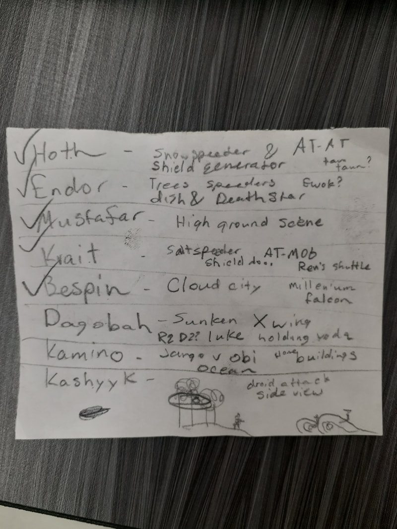 This artwork is a series of multiple small canvases. Each canvas is a gradient of a few colors with a black silhouette image over it with other details added with paint. Each canvas is showing a different scene from the Star Wars cinematic universe (a different planet, more specifically). Currently the planets I have painted include Tatooine, Mustafar, Endor, Hoth, Crait, Bespin, Dagobah, and Kamino. I chose these different planets because they have a very wide variety of environments and weather, so I was able to use very contrasting color schemes. I created each artwork by putting lines of paint onto the canvases, dragging the paint using a ruler, then using a paint brush to blend the colors more smoothly. I then made a silhouette drawing of a scene from the Star Wars using an ink pen. Some of the paintings needed special techniques, such as the toothbrush splatters for stars or lava, a frayed paintbrush for the clouds on Bespin, and exacto knife scratches for the rain and whitecaps on Kamino. The big idea of my art was to make a series the covers all of the Star Wars cinematic universe. Much of the Star wars fanbase is split as to whether the prequels or sequels should be included in the universe, so I decided to add planets from all three trilogies to bring them all together. I was, obviously, inspired by the environment designers of the Star Wars production team. The way they added depth and life to the fictional planets was so impressive, especially for its time. Star Wars has always been one of my interests, so this series just suits me. My main goals for this series was to make each canvas follow the same general idea (silhouette over blended background) but still make them unique from one another with added detail and contrasting color. Overall, I love this series. I think each individual was a smashing success, but as a whole they really suit each other. If I had to pick a favorite, I would have to choose Mustafar. The lava spray in the background turned out so good. Plus it's one of the most well-known scenes in cinematic history. Basically my only goals for this semester are to make quality artworks using new techniques. I would like to continue painting to hone my skills a bit more. My artworks I completed last semester turned out leagues better than I expected, but I still want to get better. I'd like to make a large series of artworks (which I kinda already started) and some large paintings that don't follow my silhouette ideas from last semester.
|
AuthorWrite something about yourself. No need to be fancy, just an overview. Archives
May 2021
Categories |


 RSS Feed
