|
In my opinion, my series artworks at the end of the semester were the best. I feel like I have gotten really good at acrylic pours and they just turned out so mesmerizing compared to my previous pours. The four of them turned out so nice that I plan to take them with and decorate my dorm room in Bemidji. I really impressed myself with them.
If I could redo an artwork, I would redo the portrait I made of my brother. I wasn't very good at painting like that at the time so I would like to paint it again with the skills I have now. I feel like it would turn out a lot more accurate and realistic, which is what I was going for as a whole. The best thing I've learned is to not be afraid to mess up. Don't sweat the small stuff and work through mistakes. With the final few artworks I created I messed up a number of times and continued to work through them. The mistake ones went on to be the best artworks I've created. I don't wish for a specific thing, I just wish for more time. I want to keep creating my silhouette artworks but I'm out of time. Thankfully I am taking art class again next semester.
0 Comments
My artworks are a collection of four acrylic pours on 11x14 inch canvases. Each canvas has a seperate color theme and style to the acrylic pour. The red/orange schemed painting has many oily cells and bubbles. The green schemed painting has gassy streaks. The blue/purple schemed painting is jagged and has lines that almost resemble the shape of lightning. The Yellow painting has a mix of all shapes from the previous three paintings. I created each of my artworks by doing an acrylic pour with four colors mixed with black as a neutral color. each one I used a slightly different technique when moving the paint. With the red one, I used a straw and blew a few bubbles in the paint. With the green one, I started with the paint on one side of the canvas and moved it all to the other by tilting the canvas. with the blue one, I covered the whole canvas with paint and streaked extra paint across using leftovers in the cup. The yellow painting I used a combination of all three techniques. The big idea behind my artworks is that they are all connected, but different. Technique-wise, they are all acrylic pours, but they all have different techniques used to make them look different. When it comes to appearance, I had originally planned to have three paintings that were red/orange, yellow/green, and blue/purple. That way I would have two colors on each painting and it would cover every color of the rainbow. After I created the yellow/green painting, I realized that the yellow was overtaken by the green and didn't appear. That's when I decided to make the yellow painting to complete the series. My goals overall were to make paintings that covered the entire color wheel and I think I achieved that, even though I had to make a fourth one. I think my artworks were very successful and they turned out great. I think they are my best acrylic pours I have made so far. I plan to take these artworks with me to decorate my dorm room this summer when I head to Bemidji. Also, I accidentally took this picture of Darren and I thought I should share For my final artwork of the year, I plan to make three acrylic pours. As the semester has progressed I have gotten much better at acrylic pouring and I would like to end the year on a really nice looking one. I plan on doing three pours, each being two colors of the color wheel. One the fist canvas I plan to use reds and oranges, yellows and greens on the second, and blues and purples on the third. I don't know yet what my neutral color will be (black or white). I'll figure that out when I know how light my main colors are though.
I don't really have sketches because it's impossible to predict how acrylic pours turn out, but I do have some inspiration. Again, no pictures, but there is a youtube channel called 'Tiktus Color Art' that really got me interested in acrylic pouring. I don't really use inspiration for my artworks because I like my ideas to be 100% unique. My latest artwork is an 11x14 painting of my little brother Jackson. It is a painted recreation of how first grade school photo, in which he is wearing a black shirt and has an abstract gray background behind him. I created this artwork by drawing a 0.5 inch grid on the picture and a 1.5 inch grid on the canvas, scaling up the image by 9x. I then freehand penciled in what parts of the image corresponded to each of the squares. After that, I erased both grids, leaving just a pencil drawing on the canvas. I then painted the canvas to follow the shades and colors of the original image. The big idea behind this artwork is that my brother is significant to me. Artists Observe is about registering something as significant, and who is more significant than a family member? I also did a bit of extra observing while creating the painting by putting extra attention to detail into certain features. Our family likes to joke with Jackson that he has really big and cute ears, so I made them just a little bigger in the painting than normal. Jackson also has bright icy blue eyes, and while the color was hard to match, I was able to match the dark blue ring around the iris pretty well. My goal was of course to make the painting as accurate to the original image as possible. For a while I was beginning to second guess how successful I was, but one day my two-year-old brother Jayc found me painting and asked what I was doing to Jackson. I think that if a two year old can recognize who you're painting, it must be pretty accurate. Overall, I think this artwork was very successful and turned out great. I have decided to turn this painting into a christmas gift for Jackson because I know he will think it's crazy that I painted him. I'm really happy with the outcome, and since I haven't painted a portrait before, I think this turned out great. The two main studio habits I've been focusing on are Observe (obviously) and Engage/Persist (like everyone else). Observe - In the artists observe unit, you obviously have to observe things, but I've really been trying to look closer at finer details in what I'm creating. For the first portrait I made, I only used a pencil on paper. It turned out amazing in my opinion, especially because I have never made a portrait before. Now I am working on painting a portrait of my little brother Jackson. Hopefully it turns out well too. Engage/Persist - For this unit I'm really giving portraits a try. I've never done a portrait before and these are surprisingly difficult. They don't look successful until they are done and that makes it difficult to keep working on it. But I just keep putting in the time and they turn out eventually. I'm also trying different things. My first portrait was drawn by having Jazmine pose while I made a quick sketch, then filling in details and shading. This second one, I'm going to scale up a picture of Jackson, draw in the details, then paint it to hopefully look realistic. That Engage/Persist studio habit has been my closest friend recently. I extremely dislike online school, especially when we're forced to do it. I am a very social person and being stuck at home is no bueno. There are a lot of distractions at home, but I'm keeping myself engaged and i'm toughing out this online school. My one hope is that we actually get to go back after thanksgiving. The title of my artwork is Starry Night, and it is a recreation of, you guessed it, Van Gogh's Starry Night. The piece depicts huge blue, white, and silver swirls throughout the sky with a few big yellow and white blobs scattered within. At the bottom is two curved black pieces of paper glued down to resemble the shape of hills. These black hills are covered in a blue/green paint mixture smeared over them. There is a large red/gray rust-colored building rising from the bottom of the canvas. There is also scattered pockets of white blue and silver glitter throughout the sky that follow the general colors of certain areas. I created this artwork using the flip-cup method of acrylic pouring. First, I made a cup mixture of blue, white, silver, and black paints. Next, I placed the cup upside down on the canvas and poked a hole in the top to allow the paint to fall out of the cup. Then, after letting the paint seep to the bottom of the cup, I lifted the cup off of the canvas and let the paint spread around using gravity alone. Once the paint slowed down, I tilted the canvas to force the paint to cover the rest of the open space. When the canvas was covered and the paint was still wet, I dropped blobs of yellow and white onto the painted background. I then added some glitter to the paint to make it shiny like stars. After all the paint dried, I glued two pieces of black paper to the bottom of the painting in a shape that resembled hills, and covered them in a blue/green paint mixture using a popsicle stick. Finally, after that was dry, I used a popsicle stick to paint a red/gray mixture in the shape of the foreground building from Van Gogh's Starry Night. I then let the painting dry, and it was finished. Vincent Van Gogh was my main inspiration for this artwork. I wanted to create an acrylic pour artwork and Starry Night had the perfect swirly, mixed composition to copy using this technique. The final product of this artwork expresses a calming feel. Acrylic pour paintings require minimal effort and attention to detail. You just kinda let the painting make itself. My main goal for this artwork was just to create an acrylic pour. I learned of the technique this summer and I've been fascinated ever since. I was so glad when it turned out so well. I think this artwork turned out great. For my first, real acrylic pour, I think it turned out great. 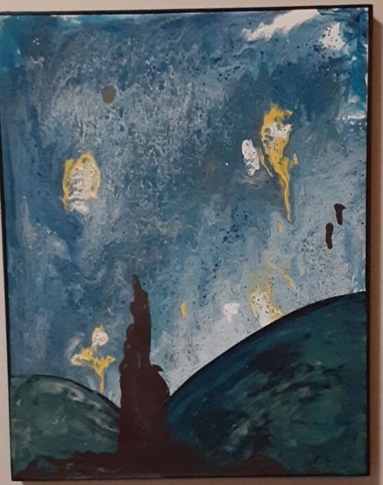 This type of observational art is different from traditional styles because the artist doesn't know what their work will turn out looking like. The artist studies human behavior and records what happens, along with their thoughts. It reminds me of a mind map in a way. It's kinda like a mind map mixed with lab results and original drawings. It's very cool. Deb's strategy for this is basically a study of human reaction. She does something that she thinks will trigger a reaction from people, the records what happens. It's so simple that all you have to do is watch people and take some pictures. If I did a stakeout I would definitely do something related to money, since people are greedy by nature. I was thinking of hanging a dollar bill from the ceiling in a hallway and seeing what people do. Would they grab it because it's unclaimed? Would they leave it because it was clearly put there intentionally? Would they take it while the hallway is crowded or wait until they're alone? I think it would be interesting. Pt 2. I love Marcello Barenghi's work. I try to recreate his artworks often but he is just so incredible with them that mine are laughable. I even subscribed to him on youtube so I can see all of his newest drawings. Of his work, I'd say I like the object drawings the most. Barenghi has a few drawings of movie/comic book characters but they just don't do it for me. (my sketchbook is in school) 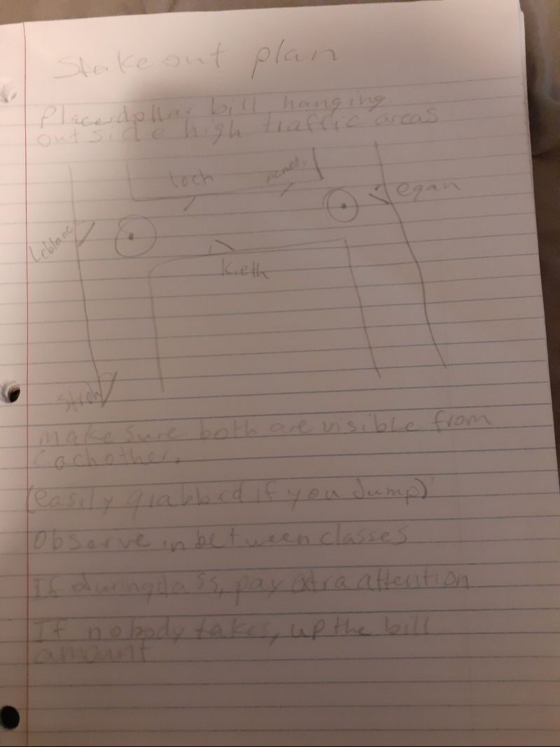 I would say the best case of appropriation shown was the artwork titled 'Fountain'. Not only did Marcel Duchamp use an item that had no relation to a previous artwork, but he also obviously changed the meaning of the object by writing 'mutt' on the side of it. While some could argue that it is not a good example of art because it didn't take much effort to create, it definitely is a good example of appropriation. I would say the worst case of appropriation shown was the artwork title 'Hymm'. Damien Hirst did not change the meaning of the object he stole from. He just made it large. The artwork itself doesn't have any perceptible meaning to it. It's just a really big anatomy toy. Currently, I think I am done with my artists steal piece. Since creating the piece I have been falling into the categories of Understand Art Worlds and Develop/Craft. Understand Art Worlds - I have been doing more research into acrylic pour techniques and different ways to make them. Acrylic pours are very interesting to me and I just love the satisfying look of the paint traveling down the canvas. If I could have infinite paint, I would make a million of these paintings. I have watched countless videos on different techniques to try or objects to use to create different shapes. I just love the technique and would love to create more in this style. Develop/Craft - While I have been researching, I have also been practicing acrylic pouring. Last week in class, I created a galaxy painting using the flip cup technique. While it didn't turn out how I'd hoped, I used some little tricks to fix the problem areas and I learned some important tips to make them turn out better in the future. The metallic paint I used was way too thick to pour out of the cup, meaning I need to pay better attention to my mixture ratios. 1. Roy Lichtenstein elevates the value of the artwork by changing it dramatically. He limited the artwork to only primary colors, which really makes every shape pop off the page. He also added a speech bubble into the artwork to almost change the meaning of the original image. This is the basis of pop art, taking a piece and changing it so dramatically that you can pass it off as your own. He makes this picture of Mickey Mouse and makes it almost look like a comic book 2. Many pop artists use appropriation to change the way their artworks are perceived in relation to the original piece's perception. Appropriating an artwork with another contrasting piece makes it easy to pass of as one's own. 3. Many would believe Warhol's prediction has become true because many people do have their fifteen minutes of fame. In modern times, it is so easy to find content created by other people that you don't need to be famous to spread your own content. Whether it be an hour-long documentary you hand created or a picture of your dog you took while playing a video game, millions of people can access the post and give their opinions upon it. Whether they love it or hate it, they gave you their attention, which is all fame is in the end. |
AuthorHey I'm jaden, I'm a senior this year, and I really like to draw. Like, I REALLY like to draw. Only with pencil though. 90% of the time I only create art with a pencil. Archives
January 2021
Categories |


 RSS Feed
