|
I feel like my best artwork this semester was my final deer painting. Not only was it a nice change of pace from previous artworks, but it was so satisfying to create a painting with a brush. It wasn't the first, as I painted a portrait of my brother earlier this semester, but it's been a while. It also just turned out so nice. I am very proud of it.
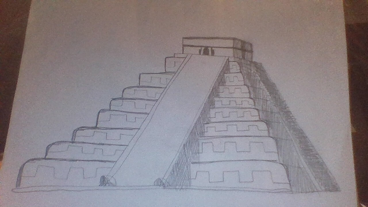
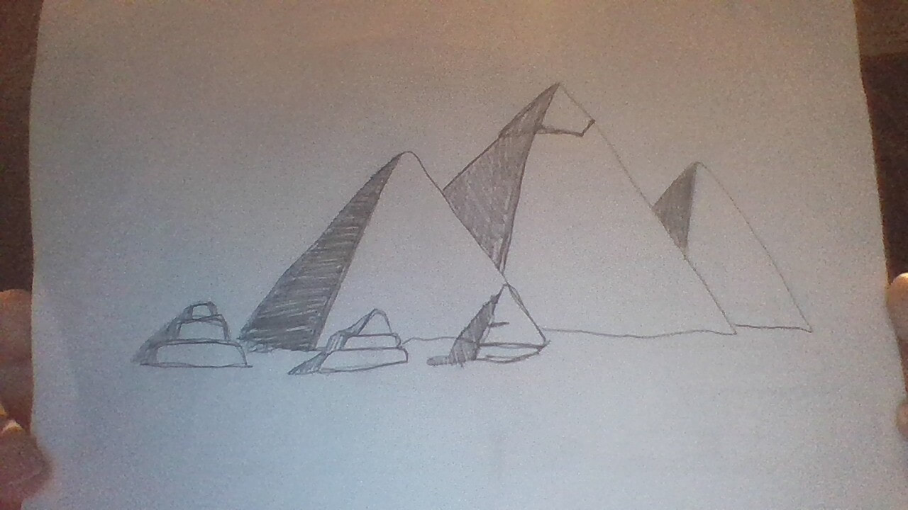
If I could redo an artwork, I would rebuild my impossible waterfall from the ground up. I wasn't able to finish it because we switched to distance learning and then it got ruined by my brother, but it was a cool concept and I'm curious to see if I could've pulled it off. What I learned in this class is to stretch myself. While I do much prefer 2-dimensional art, making 3D art and sculptures was a lot of fun. I really enjoyed working with the wire earlier in the year. It was so different from my usual art that it was weird making it but fun at the same time. If I had to say something, I wish we had more time. I wanted to make a paper accordion kinetic sculpture but they take a veeeeery long time to make. Like this - > https://www.youtube.com/watch?v=Pik2BcQF8ZQ
1 Comment
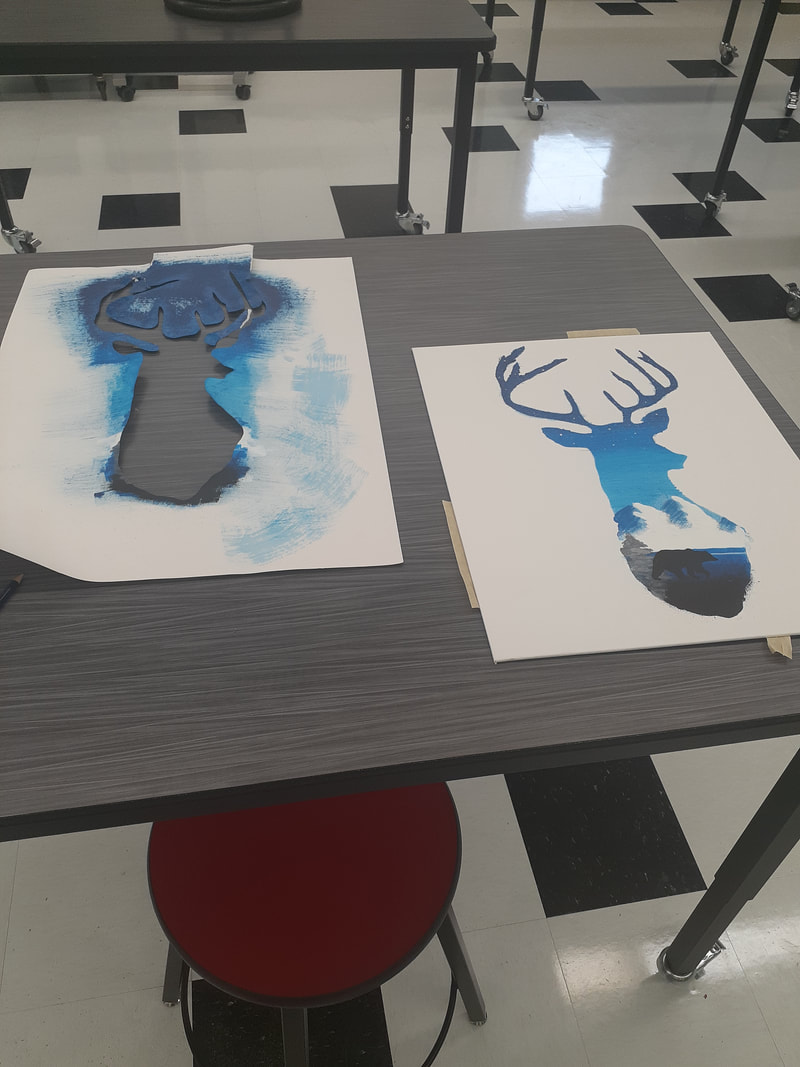
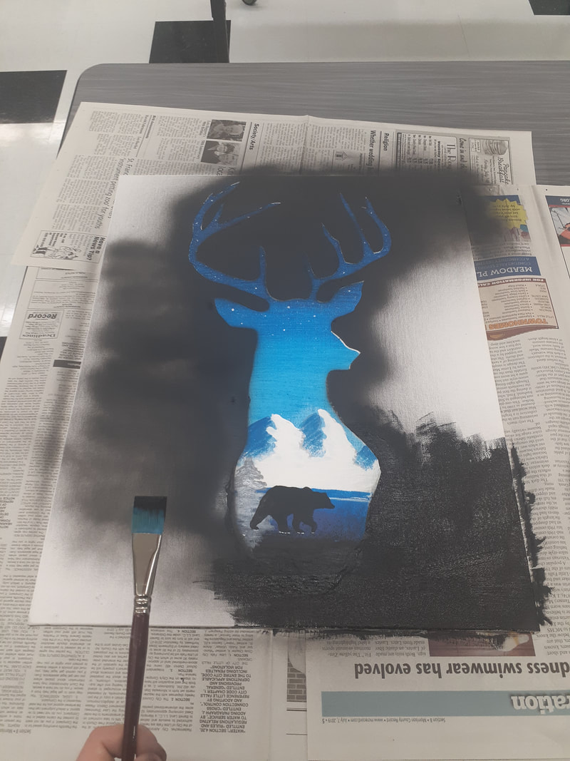
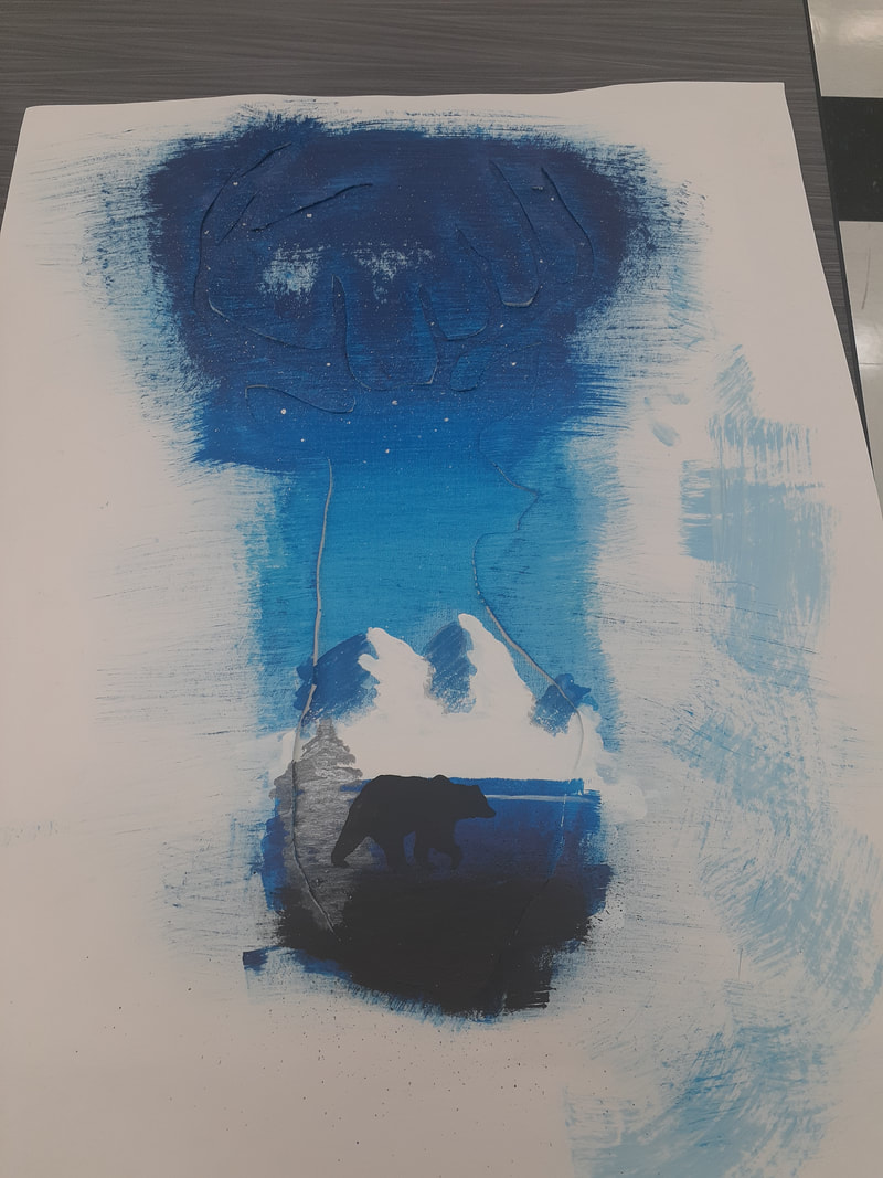
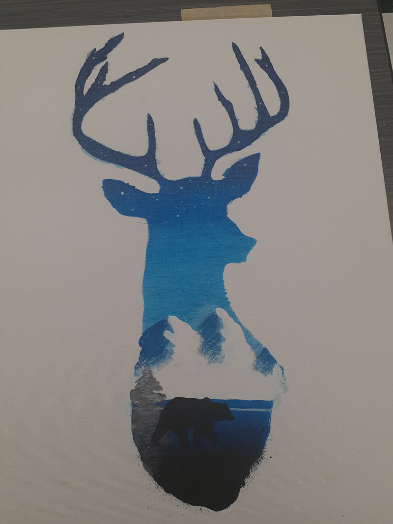
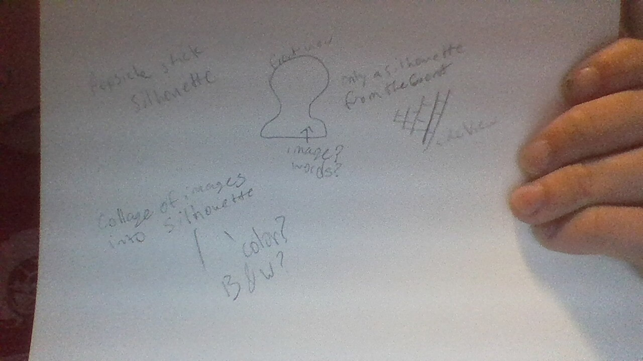
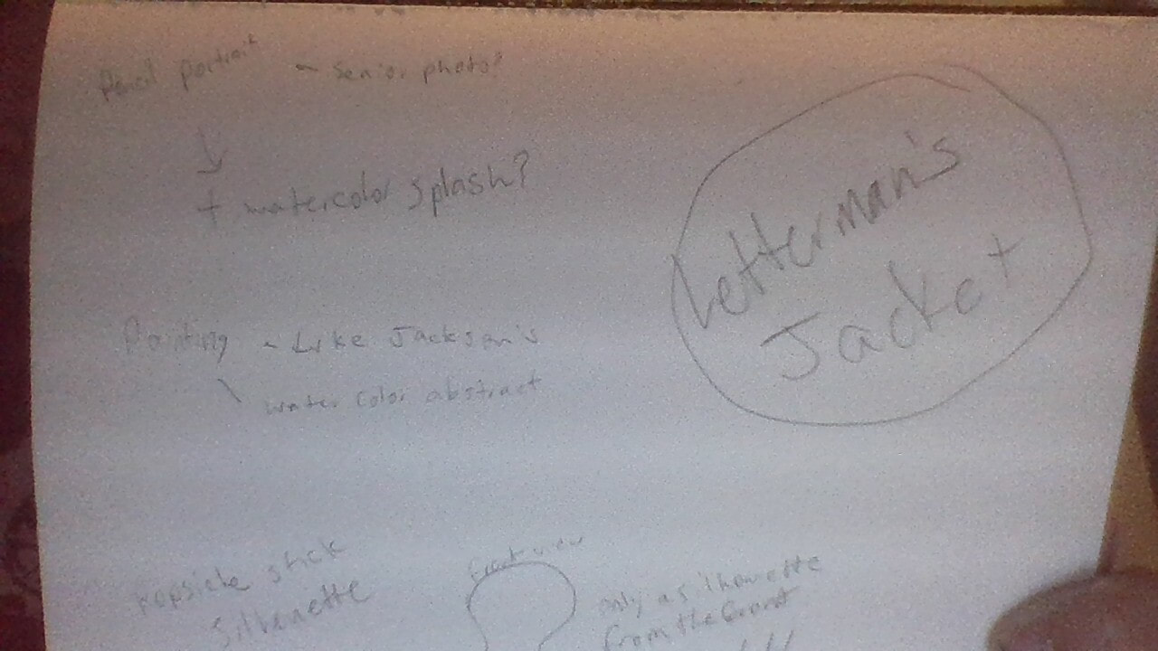
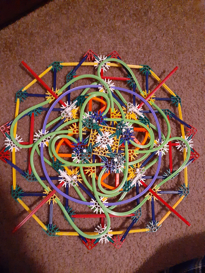
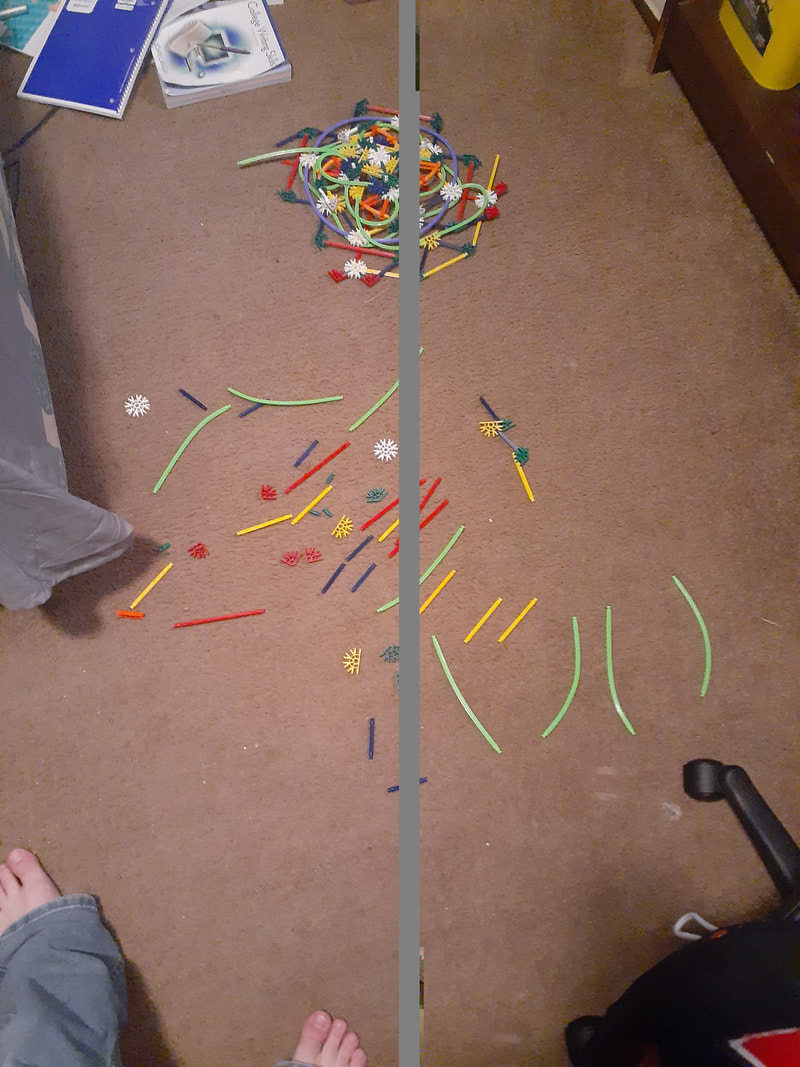
My identity artwork is a silhouette of a buck from the shoulder up on a black background. Within the silhouette is a nature scene. The scene includes white snowy mountains in the background, a single silver pine tree above that, and a silhouette of a black bear in the foreground.The sky is a wide range of blues and so is the land the bear walks on. The sky area is speckled with white stars. I began my artwork by creating a stencil of the deer silhouette. I painted all of the blues in the background using the stencil. I then painted the white mountains and the blue land under it. Once it was dry, I painted the pine tree and the bear on top of it. I then used a toothbrush to speckle on the stars. Once it was all dry, I painted a black outline of the deer and painted the whole background black. I then used an exacto knife to scratch small parts of the painting for extra detail. I scratched the bottom of the bear's feet and small scratches in the tree to add texture. The reason I used a deer image to show identity is because the idea came from one of my family members, and what better way to show your identity than by those who shaped your identity. My aunt asked me to 'try' to make her a painting to put on her wall and I decided to go all out and make her the best painting I could. I feel like family is a major part of a person's identity. Those who you grow up with tend to have a larger impact on who you are than others. Not only was it an idea of my aunt's, but it also represents us because we live in a snowy state. Hunting is also a large tradition in our family so the deer and bear both relate to us in that way. My main goal for this artwork was to make something suitable for my Aunt's wall and I definitely succeeded. My aunt was blown away by the painting, way exceeding her expectations. My family liked the painting so much that they are all asking me to make more. I had to make a second painting to appease my mom so she can hang it up home as well. Same as my family, I was also blown away by my painting. It turned out so much better than I had hoped and it was a lot of fun to create. I have not put this much effort into a painting before and I really impressed myself. For this final artwork I thought of a few ideas to create but they don't really express me. I thought of making a silhouette of myself out of popsicle sticks and covering it with are that would represent me, but I ultimately decided against it. I think I am going to create a self portrait pencil drawing. I will most likely use one of my senior photos and draw it larger to fill a full sheet of paper. After the last couple of portraits, I feel like one of myself would turn out great. I might add abstract splashes of watercolor to the drawing but I don't know exactly how yet. This artwork is a two foot wide mandala made entirely of K'nex. It has a variety of colors and shapes that all coincide towards the center white piece. The pieces and angles of the artwork are mostly sharp and exact but I made sure to include some bendable pieces that could add some smooth curvature to the mandala. I created my artwork by starting with a single white piece and adding more and more to it in a symmetrical fashion. Since it is a mandala, I tried to give the artwork as many lines of symmetry as possible, but with k'nex, four is that magic number. If you do everything in sets of four, the pieces fit well together and are less likely to break because of internal stress. The big idea behind my artwork is to show balance. There is a wide variety of shapes and colors, but the mandala isn't predominantly one color or piece. The mandala has a good mixture of both straight and curved pieces. While it may look like a mess of pieces, the mandala is actually symmetrical around the center point. It is a well balanced piece in all areas and doesn't draw attention to any one part. I didn't have many goals for this artwork. During class you mentioned mandalas and I just thought of making one in three dimensions. I didn't have a plan going into this artwork, I just kinda did it. Whatever felt right is what I added. Overall, I think this artwork actually turned out fairly well. I made the artwork with no plan of action, but it turned out pretty nice. I really wish we were still in school instead of distance learning. Then I could finish works and make them better without my brother attacking. (second picture got corrupted a bit but it's easy to tell what the image is) 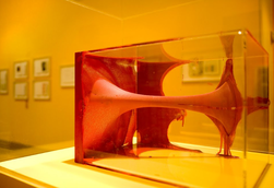 I would say the main principal this artwork represents is emphasis. The odd yet interesting shape and bright red color are very eye-catching, especially because they are in a glass box. I just think it's interesting to look at. Title: Anish kapoor, Untitled Creator: Anish Kapoor Date Created: 2012-02-26/2012-04-08 Type: Perspex, hand-tinted stocking, paint  The elements of art are the basic building blocks of an artwork and the principles of art are how the artists use the elements in the design of their artwork.
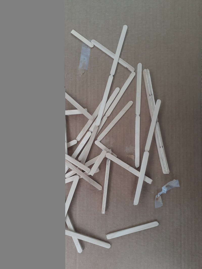
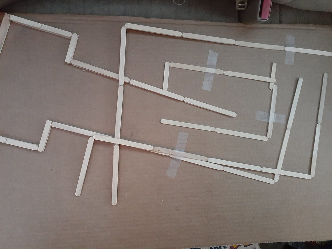
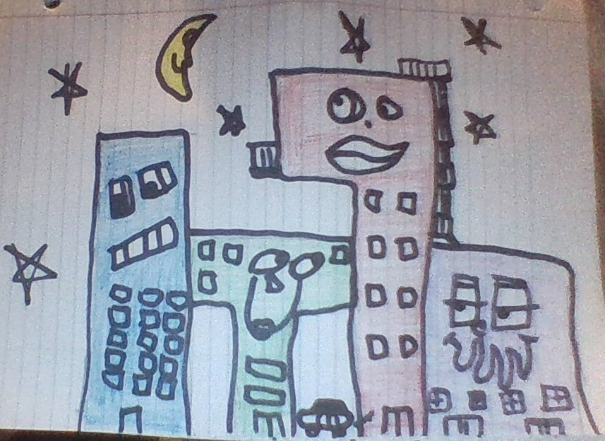
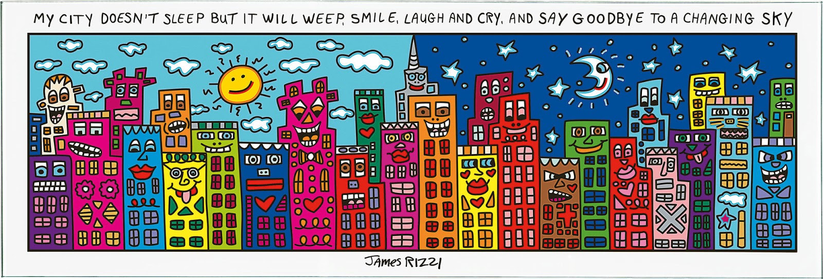
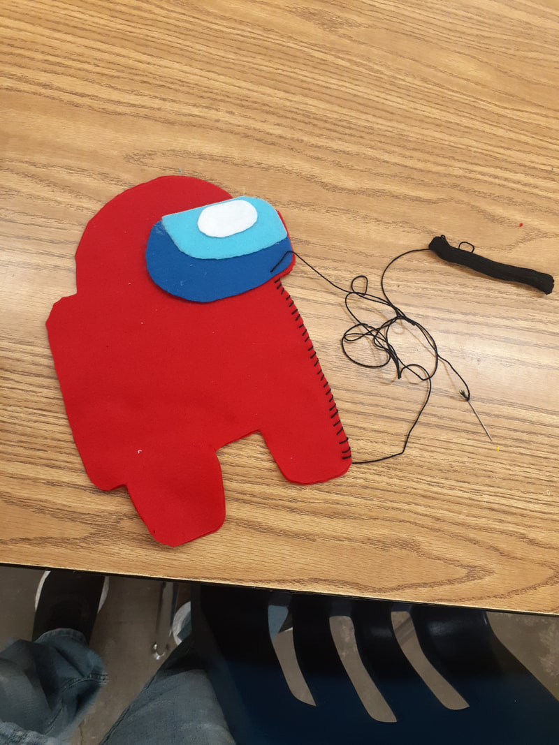
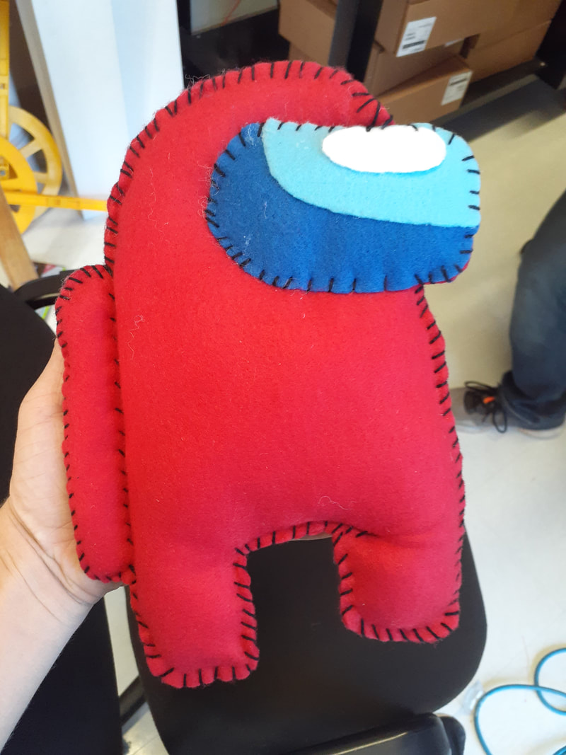
Elements: Texture, color, space, form, shape, line, and value Principles: Movement, contrast, unity, balance, rhythm, emphasis, pattern My artwork is titled Possible Waterfall. It is a three dimensional popsicle stick and cardboard sculpture held together using hot glue. from almost any angle it looks like a mess of pieces, but if you look at it from one specific spot, the pieces line up and make an impossible shape resembling M.C. Escher's Impossible Waterfall. The shape makes it seem as if the water is flowing far away and uphill but it ends up flowing back into itself. in reality, there is no flowing water. In the drawing, gravity doesn't exist, so you can draw the water as if it were flowing, but in reality the water has to suspend itself from the beginning pool area. I created my artwork by hot glueing popsicle sticks together in a few shapes that line up only when viewed from a specific angle. I then planned to hot glue cardboard to the bottom of the pieces to make them resemble the canals of the original drawing. I also planned to put blue tissue paper into the canals to make them look as it water was flowing. For the self suspending tissue paper, i planned on attaching the paper to blue pipe cleaners. My only inspiration was M.C. Escher's Impossible Waterfall. I have always loved Escher's work and illusions in general, so taking something that was literally supposed to be impossible and making it 3D was interesting to me and seemed like a fun challenge. My goals for this artwork were originally to make the illusion work. I wanted it to only make sense when viewed from the angle it was originally drawn in. That was when I started. Now, my only goal is to finish it. I have no idea if that will happen, but we'll see. So far I think it was going good. I got cut off before I was able to make any real progress but I was on my way there quickly. I feel like the illusion would have worked as I planned and sketched it out mathematically and it worked when i modeled it in 3D online, so I really wish I could've kept working on it. My two-year-old little brother Jayce got my pieces that I was making the sculpture with. I have two images; the pieces when I got them from the school, and the pieces after my brother got them. The picture of broken pieces got half corrupted when I emailed it to myself. James Rizzi's style is very basic. His artworks consist of solid colors and sharp edges/contrasts. His images have no shading or blending. The buildings in his work have unique faces on them and are of unorthodox shapes and colors. His artwork is bright and colorful, but basic at its core. I do not believe Rizzi's work is successful because it looks as if a child could have created it. The funky shapes and bright colors make it look like a drawing that would be hanging on a fridge. The only part of his work that does not remind me of children is the sharpness of the edges and overall solidity of the colors. If a certain part is supposed to be one color, it is exactly that color throughout; no shading, no blending, no variety. I personally don't like this artwork. I don't like how basic and lackluster it is. It lacks depth and substance. I like intricate pieces with details that allow you to focus on one part at a time. With this art style you can't focus on one part because there is no specific detailing. You are forced to look at it as a whole and be content with "here's some bright colors and cute faces. Hope you like it." I don't like that. I wouldn't change my artwork. I would just toss it. I might sound dramatic but I don't enjoy his work. Yes, it's cute, but not my forte. My plan for the architectural drawing is to created a three dimensional version of M.C. Escher's 'Waterfall' out of popsicle sticks, glue and possibly task board. Envision - This artwork has been in my mind for some time, but I never really knew how to accomplish it. I am fascinated by M.C. Escher's work and have always wanted to recreated some part of it some way, but I never knew how. I'll admit, it's quite a stretch to try and create something that is literally titled as impossible, but I think I've figured out how to 3D render this into a sculpture. Stretch/Explore - Every time I create something in this class I am stretching myself a little more. The only 3D creations I have ever made outside of this class are in robotics. The Among Us plushie was new and different, but it wasn't hard to create. This next piece, however, this is going to be a challenge. 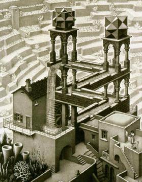  1 & 2. The type of architecture that most interested me was the gothic style. I really enjoy the over-the-top intricacies on the side of the notre dame cathedral. The symmetry and just overall prettiness is very aesthetically pleasing. 3. I likely will not use the gothic style in my artwork. My artwork is going to be a three-dimensional recreation of an M.C. Escher drawing. His drawings are more surreal modernism than anything else, and they definitely are not gothic. The latest thing I created in media fair was a plushie of the red avatar from Among Us (look it up, you'd like it). My girlfriend and I named him Xavier by the way. I have never made a plushie or any other type of hand stitched creation. The closest to this project that i have done before is using a sewing machine to make pants in seventh grade. For my next artwork I am considering creating an M.C. Escher-esque painting in three dimensions, likely with popsicle sticks and cardboard. I might use task board as part of it, but I'm not sure yet. Next time i'm in class I hope to begin this artwork already. I have a feeling it is going to be large and take a long time, so I would like to get as much work time as possible. |
AuthorHey I'm jaden, I'm a senior this year, and I really like to draw. Like, I REALLY like to draw. Only with pencil though. 90% of the time I only create art with a pencil. Archives
January 2021
Categories |
 RSS Feed
